Star clusters and their HR diagrams

Written by Elvi Haaramaki and Sof Hachem

Star clusters

In this project, we are looking at objects called star clusters, which are groups of stars that are gravitationally bound together. There are two types – globular clusters and open clusters.

Globular clusters are large collections of thousands of millions of red stars, most of which are population II stars formed a few million years after the Big Bang. The stars are densely packed together, and the shape of the cluster is roughly spherical1

Figure 1: Globular cluster M3.

Open clusters are made up of a few hundred stars which are much less densely packed together than globular clusters, and are without a distinct shape. These stars are younger blue stars, tens of millions of years old, and are weakly gravitationally bound2. For this project we took pictures of M35, M36, and M37, which are all open clusters. 

Open clusters are ideal for the purposes of the project, since the stars are further apart from each other, making them easier to resolve individually. This is necessary to be able to find the apparent magnitudes of the stars. Additionally, it is assumed that all the stars in the cluster are the same distance from us, allowing us to calculate the absolute magnitudes.

Figures 2 and 3: Open clusters M36 and M37.

HR diagrams

HR diagrams are a useful tool in astronomy, as plotting stars within a cluster based on their magnitude and colour-temperature allows the study of the stars’ relative stellar evolutionary stages and provides an idea about the age and the relative distances of given clusters3, which was also the objective during the project. 

For the data here, green and blue filters4 were used to attain the difference in the magnitudes corresponding to a colour index in the observational HR diagram, being plotted against the apparent (green) magnitude.  

Figures 4 and 5: HR diagrams for M36 and M37.

The upper left region in the diagrams corresponds to the bluer and brighter stars, while the redder and dimmer stars are located at the bottom right. The stars in a HR diagram for a relatively young open cluster, which mostly contains stars burning hydrogen into helium, are expected to lie along the main sequence branch – this is seen in the HR diagram for M36.  In older clusters, the main sequence cut-off becomes more visible as the more massive stars burn hydrogen at faster rates and are consequently spending less time in the main sequence, leading older clusters to have more prominent red-giant branches. In globular clusters, more stellar evolutionary stages are present due to the clusters age, which can be seen in the HR diagram for M3.   

Figure 6: HR diagram of M3, showing more distinct branching and stars in variety of evolutionary stages6.

Identifying the turnoff point from the diagram and comparing the mass and brightness of the most massive remaining star in the main sequence, allows us to further estimate the age of the star and – as stars within the cluster are estimated to have formed around the same time – the age of the cluster5

References: 

1: https://www.britannica.com/science/globular-cluster 

2: https://www.schoolsobservatory.org/learn/astro/stars/clusters/openclus 

4: https://www.astronomik.com/en/photographic-filters/deep-sky-rgb-colour-filters.html

3: https://en.wikipedia.org/wiki/Hertzsprung%E2%80%93Russell_diagram 

5: https://www.scientificamerican.com/article/how-do-scientists-determi/ 

6: https://jila.colorado.edu/~ajsh/courses/astr1120_03/text/chapter4/l4S8.htm (Figure 6)

2020 Vision: Spectral Classification

By Ceinwen Cheng

The most typical way to classify stars is based on their spectral profiles. Electromagnetic radiation is passed through filters displaying lines on a spectrum. The intensity of each spectral line provides information on the abundance of the element and the temperature of the star’s photosphere.

The system for classification is named the Morgan-Keenan (MK) system, using letters O, B, A, F, G, K and M, where O-type is the hottest and M-type is the coolest. Each letter class has a further numerical subclass from 0 to 9 where 0 is the hottest and 9 is the coolest. In addition to this, a luminosity class (Yerkes Spectral Classification) can be added using roman numerals, based on the width of the absorption lines in the spectrum which is affected but the density of the star’s surface.

The aim of  our very last imaging session was to image spectra, including stars from all the classes in the MK-system:

  • 0-Class: Alnitak
  • B-Class: Regulus and Alnilam
  • A-Class: Alhena and Sirius
  • F-Class: Procyon
  • G-Class: Capella
  • K-Class: Alphard
  • M-Class: Betelgeuse

For each star, two sets of spectra were recorded at a 60 s exposure set on 2×2 binning. As the exposure time is relatively long, it was important to manually keep the star between the cross-hairs of the eyepiece while imaging, as there is a tendency for the star to stray from the center of the telescope as the earth rotates.

There is a trend of worsening spectra as you move down the spectral types. As luminosity is proportional to the fourth power of temperature, cooler stars in the lower end of the spectral classes such as K and M-classes are dimmer than an O-class. Displayed below are the spectra we collected for each star, excluding Alphard and Betelgeuse as no identifiable spectral lines were seen for both stars.

spectra alnilam B

Alnilam B-class: For this class we expect medium amounts of Hydrogen Balmer lines, and some neutral Helium lines.  We observe spectral lines of    H-γ, H-δ,  He I, and C III in our experimental spectra analysis.

spectra alnitak O

Alnitak O-class:  In the hottest class of stars, we expect to see ionized helium features. In this graph, we see prominent absorption lines of H-β, Hγ, Hδas well as He I, He II and He III, which are in correlation with our expectations.

spectra capella G

Capella G-class: We expect heavier elements such as calcium and for the Hydrogen Balmer lines to be less prominent. Compared to stars in A or F-classes, our experimental Capella spectra have less defined H-ε, Hγ, Hδ absorption lines, but a more obvious Ca II absorption line.

spectra sirius A

Sirius A-class: This class has the strongest features of the Hydrogen Balmer series. We observe H-β, Hγ, Hδ, Hε strong spectral lines, and slight H-ζ and H-η absorption lines.  Additionally, characteristically of A-class stars, Sirius displays spectral lines of heavier elements such as Mg II and Ca II.

spectra alhena

Alhena A-class: Alhena’s spectra are very similar to Sirius’s, being in the same class.

spectra regulus B

Regulus B-class: Displaying prominent H-β, Hγ, and Hδ Balmer lines, it is in the lower temperature end of B-class, almost an A-class. It has strong Balmer features but still a characteristic He I absorption line that places it in the B-class.

spectra procyon F

Procyon F-class: We expect to see ionized metals and weaker hydrogen lines than A-classes. Our data shows weaker H-β, Hγ, and Hδ Balmer lines than Alhena or Sirius, but more prominent absorption lines for ionized elements such as Ca II .

Stars can be assumed to be black bodies, and its absorption spectra will overall take the shape of its black body radiation. After extracting the absorption spectra, we attempted to normalize it by dividing the spectra data by its polynomial interpolation to the fourth degree. The polynomial interpolation is our estimate of the black body curve that would be displayed by the star.

Characteristically, an ideal normalize spectrum will not deviate from 1.0 on the y-axis, other than peaks where the absorption lines are. We can directly compare that the peaks in the normalized graphs are where the troughs in the initial spectra data are.

normalized alhena

Normalized spectra, Alhena A-class

normalized alnilam B

Normalized spectra, Alnilam B-class

normalized alnitak O

Normalized spectra, Alnitak O-class

normalized capella G

Normalized spectra, Capella G-class

normalized procyon F

Normalized spectra, Procyon F-class

normalized regulus B

Normalized spectra, Regulus B-class

normalized sirius A

Normalized spectra, Sirius A-class

Code: Extracting spectra and normalizing data

From here, we will go through how we extracted the spectra from the .fit files using Python, as well as the normalization of the spectra through a polynomial interpolation. This is for 1 star, specifically Alhena, where the code is repeated for the rest of the stars as well, where the only deviation is the addition of absorption lines manually.

Step 1:

#importing relevant modules
import numpy as np
import os
import math
from PIL import Image
from PIL import ImageOps
import astropy
%config InlineBackend.rc = {}
import matplotlib
import matplotlib.pyplot as plt
%matplotlib inline
from astropy.io import fits
from astropy.nddata import Cutout2D
import os
from numpy import asarray
import matplotlib.image as mpimg
from specutils.spectra import Spectrum1D, SpectralRegion
from specutils.fitting import fit_generic_continuum
from numpy import *
import numpy.polynomial.polynomial as poly
from scipy import interpolate


Step 2:

#opening both files to check stats, and positioning a cut out around both spectra
hdulista1 = fits.open(r"C:\Users\Ceinwen\Desktop\ProjectPics\Spectra\alhena_953.fit")
hdulista1.info()
print(repr(hdulista1[0].header))
dataa1 = ((hdulista1[0].data)/256)

positiona1 = (838.5, 660)
sizea1 = (150,1677)
cutouta1 = Cutout2D(np.flipud(dataa1), positiona1, sizea1)
plt.imshow(np.flipud(dataa1), origin='lower', cmap='gray')
cutouta1.plot_on_original(color='white')
plt.colorbar()


hdulista2 = fits.open(r"C:\Users\dhruv\Desktop\Project Pics\Spectra\alhena_954.fit")
dataa2 = ((hdulista2[0].data)/256)

positiona2 = (838.5, 690)
sizea2 = (150,1677)
cutouta2 = Cutout2D(np.flipud(dataa2), positiona2, sizea2)
plt.imshow(np.flipud(dataa2), origin='lower', cmap='gray')
cutouta2.plot_on_original(color='white')
plt.colorbar()

We open both .fit files to check the stats of the data, and cut out the part of the image with the spectra for both data sets, as you can see, the spectra are very faint.

Step 3:

#plotting the cut out

plt.imshow(cutouta1.data, origin='lower', cmap='gray')
plt.colorbar()

plt.imshow(cutouta2.data, origin='lower', cmap='gray')
plt.colorbar()

Plotting the cut-out, taking a closer look, the spectra lines are more visible now.

Step 4:

#converting the file's data into an array and plotting it

xa1 = cutouta1.data
a1 = np.trapz(xa1,axis=0)
plt.plot(a1)

xa2 = cutouta2.data
a2 = np.trapz(xa2,axis=0)
plt.plot(a2)

Step 5:

#finding the mean of both data and plotting it, alongside spectral lines.

a = np.mean([a1, a2], axis=0)
plt.plot(a,"r")
plt.axvline(x=206,color='b',ls=":")
plt.axvline(x=271,color='b',ls=":")
plt.axvline(x=325,color='b',ls=":")
plt.axvline(x=368,color='b',ls=":")
plt.axvline(x=525,color='b',ls=":")
plt.axvline(x=805,color='b',ls=":")
plt.axvline(x=967,color='b',ls=":")
plt.axvline(x=1401,color='b',ls=":")

array with lines

Step 6:

#doing a line of best fit through the spectral lines's positions.

x1=np.array([206,271,325,368,525,805,967,1401])
y1=np.array([3835.384,3889.049,3933.66,3970.072,4101.74,4340.462,4481.325,4861.3615])
m1, b1 = np.polyfit(x1, y1, 1)
plt.scatter(x1,y1,color="red")
plt.plot(x1,m1*x1+b1)
print(m1)
print(b1)

straight line

Step 7:

#mapping the pixel number to wavelength
xo1 = np.arange(1,1678)
func1 = lambda t: (m1*t)+b1
xn1 = np.array([func1(xi) for xi in xo1])
plt.plot(xn1,a,"r")
plt.xlabel ('Wavelength ($\AA$)')
min(xn1),max(xn1)

in wavelenght

Step 8:

#plotting the spectra in term of wavelength and including named spectral lines.
plt.plot(xn1,a,"r")
plt.xlabel ('Wavelength ($\AA$)')
plt.axvline(x=4861.3615,color='orange',label="H-\u03B2",ls=":")
plt.axvline(x=4481.325,color='magenta',label="Mg II",ls=":")
plt.axvline(x=4340.462,color='g',label="H-\u03B3",ls=":")
plt.axvline(x=4101.74,color='b',label="H-\u03B4",ls=":")
plt.axvline(x=3970.072,color='c',label="H-\u03B5",ls=":")
plt.axvline(x=3933.66,color='lime',label="Ca II",ls=":")
plt.axvline(x=3889.049,color='m',label="H-\u03B6",ls=":")
plt.axvline(x=3835.384,color='y',label="H-\u03B7",ls=":")
plt.legend()

in wavelenth plus lines

Step 9:

#doing a polynomial fit to the 4th degree, plotting it on the same graph as the spectra
coefs1 = poly.polyfit(xn1, a, 4)
ffit1 = poly.Polynomial(coefs1)
plt.plot(xn1, ffit1(xn1))
plt.plot(xn1,a,"r")
plt.xlabel ('Wavelength ($\AA$)')

polynomial interpolation

Step 10:

#diving the spectra by the polynomial fit to normalise, and plotting normalised graph

plt.plot(xn1,ffit1(xn1)/a)
plt.xlabel ('Wavelength ($\AA$)')

Finally, dividing the spectra by the polynomial interpolation to normalize the spectra.

normalised


Brief Note:

The end of the 2020 third year project came quicker than most years before us, unexpected situations such as strikes and social distancing due to coronavirus have unfortunately prevented us from collecting any more data on the variations in the apparent magnitude of Betelgeuse, detailed in the previous blog post. We have had to cancel our poster and presentation as well.

We are all saddened by the fact we can’t clamber about the dark rooftop that overlooks the Thames and half of London anymore, but I believe this project has inspired many in the group to go further in the field of Astronomy. We all want to thank our absolutely brilliant supervisor, Prof. Malcolm Fairbairn, for his guidance and leadership. He has been looking out for us in more than this project, being an amazing mentor.

2020 Vision: Tracking of Betelgeuse – Recent dimming and brightening

Written by Ceinwen Cheng

Betelgeuse, what used to be the 10th brightest star in the night sky, lies on the left shoulder of Orion’s constellation. This reddish star attribute’s its color to its classification of being a red supergiant around 15 times the mass of the Sun.

However, ever since October 2019, Betelgeuse’s apparent magnitude has had a drastic decrease that can be observed with the naked eye, dimming from an apparent magnitude of 0.6 in October 2019 to 1.8 in early February. The apparent magnitude scale is reverse logarithmic, i.e the lower the magnitude, the brighter the star. A star of apparent magnitude 1.0 is 2.512 times brighter than a star of apparent magnitude 2.0.

d41586-020-00561-z_17744012

A graph published by Nature news article in February 26th c 2020 displaying a graphical representation of Betelgeuse’s apparent magnitude

Additionally, as recently as February 22nd, Betelgeuse has started brightening again, an increase of almost 10% from the dimmest point. There are many proposed explanations, one being a change in extinction and therefore not a change in the actual luminosity of the star, which is supported by the fact that the infrared observations have of Betelgeuse has barely changed since the dimming phenomenon. In astronomy, extinction is the absorption and scattering of light particles by cosmic dust between the observer and the light emitter.

We acknowledge several problems measuring the apparent magnitude of Betelgeuse in Central London, one of the most light polluted cities in Europe. If we measure Betelgeuse directly, our data will be skewed by a range of obscure interference such as clouds, atmospheric seeing, thermal turbulence, air and light pollution. These factors are hard to mitigate and could alter or change the trend of our data. Therefore, we approach this project by also tracking a star close to Betelgeuse that apparent magnitude isn’t changing much, Betelgeuse’s sister star Bellatrix. We are interested in the ratio of luminosity between Bellatrix and Betelgeuse.

Imaging both Bellatrix and Betelgeuse in 5 different sessions in 2020, on the 28th Jan, 3rd Feb, 11th Feb, 17th Feb, 2nd  March 2020,  we collected the images to be processed into a trend. Using Python 3, Dhruv Gandotra, our python expert, extracted the data from our images to produce the following trend in the graph below, showing the trend of the ratio of magnitudes between Betelgeuse and Bellatrix. Additionally, he also found a source online [twitter handle @Betelbot] that tracks the apparent magnitude of Betelgeuse over the same time frame as ours, allowing us to peer review our data.

Data points betelbot and ours (5 sessions)

@Betelbot ‘s measure of Betelgeuse apparent magnitude (in red), compared to our experimentally calculated difference in apparent magnitude between Betelgeuse and Bellatrix inverted.  Where Day 0 is the 28th Jan.


trendline betel bot and ours

@Betelbot ‘s data and ours combined, with trend line calculated for both sets of data.


Brief Description of our code:

Importing our .fit files (a file format used in astronomy) into python, there are first and foremost several important points we need to take into account. All the images have noise, some images have hot pixels, and the position of the stars differ for each image. To solve these problems at the same time, Dhruv came up with an idea, to select a picture form a session, use an array to find the position of the maximum pixel brightness, then define a box around the star of fixed width, and only take data from that box. This way, any hot pixels can be cut out, the amount of noise will be relatively the same for the pictures in each session, and as the position of the stars do not move around too much, the star will still be in the box of data.

Note: We will be attaching parts of the code alongside its explanation for future references

After importing all our relevant modules into our code, we must first preview a single Betelgeuse image from the session, looking at the file’s information and then the data available in the file. From this we can extract the minimum, maximum, standard deviation, or mean of the pixel brightness.

Code:

#importing relevant modules
import numpy as np
import os
import math
from PIL import Image
import astropy
%config InlineBackend.rc = {}
import matplotlib
import matplotlib.pyplot as plt
%matplotlib inline
from astropy.io import fits

#opening single image and it's data
from astropy.nddata import Cutout2Dhdulist1a = fits.open(r"C:\Users\dhruv\Desktop\Project Pics\Betelgeuse\Session 1\betelgeuse_750.fit")
hdulist1a.info()
print(repr(hdulist1a[0].header))
data1a = ((hdulist1a[0].data)/256)

print('Min:', np.min(data1a))
print('Max:', np.max(data1a))
print('Mean:', np.mean(data1a))
print('Stdev:', np.std(data1a))

The next part of the code involves finding the position of the maximum pixel brightness i.e. where the star will be located, through an array. From this, we create a 50×50 cut out around the star, and graphed the cut out. Now that we have a preview on an image, we can repeat this easily for the 10-15 other images taken per session, add all their data and find the mean average of their data.

Code:

#locating position of star and creating a cut out
position1 = (223, 248)
size1 = (50,50)
cutout1a = Cutout2D(np.flipud(data1a), position1, size1)
plt.imshow(np.flipud(data1a), origin='lower', cmap='gray') #using np.flipud as the image is inverted
cutout1a.plot_on_original(color='white') #displacing the position of the cut out in the image
plt.colorbar()

#plotting cut out
plt.imshow(cutout1a.data, origin='lower', cmap='gray')
plt.colorbar()

#importing the rest of the images taken in the session
hdulist2a = fits.open(r"C:\Users\dhruv\Desktop\Project Pics\Betelgeuse\Session 1\betelgeuse_751.fit")
hdulist3a = fits.open(r"C:\Users\dhruv\Desktop\Project Pics\Betelgeuse\Session 1\betelgeuse_752.fit")
hdulist4a = fits.open(r"C:\Users\dhruv\Desktop\Project Pics\Betelgeuse\Session 1\betelgeuse_753.fit")
hdulist5a = fits.open(r"C:\Users\dhruv\Desktop\Project Pics\Betelgeuse\Session 1\betelgeuse_754.fit")
hdulist6a = fits.open(r"C:\Users\dhruv\Desktop\Project Pics\Betelgeuse\Session 1\betelgeuse_755.fit")
hdulist7a = fits.open(r"C:\Users\dhruv\Desktop\Project Pics\Betelgeuse\Session 1\betelgeuse_756.fit")
hdulist8a = fits.open(r"C:\Users\dhruv\Desktop\Project Pics\Betelgeuse\Session 1\betelgeuse_757.fit")
hdulist9a = fits.open(r"C:\Users\dhruv\Desktop\Project Pics\Betelgeuse\Session 1\betelgeuse_758.fit")
hdulist10a = fits.open(r"C:\Users\dhruv\Desktop\Project Pics\Betelgeuse\Session 1\betelgeuse_759.fit")
hdulist11a = fits.open(r"C:\Users\dhruv\Desktop\Project Pics\Betelgeuse\Session 1\betelgeuse_760.fit")
hdulist12a = fits.open(r"C:\Users\dhruv\Desktop\Project Pics\Betelgeuse\Session 1\betelgeuse_761.fit")
hdulist13a = fits.open(r"C:\Users\dhruv\Desktop\Project Pics\Betelgeuse\Session 1\betelgeuse_762.fit")
hdulist14a = fits.open(r"C:\Users\dhruv\Desktop\Project Pics\Betelgeuse\Session 1\betelgeuse_763.fit")

#extracting the data of each image
data2a = (hdulist2a[0].data)/256
data3a = (hdulist3a[0].data)/256
data4a = (hdulist4a[0].data)/256
data5a = (hdulist5a[0].data)/256
data6a = (hdulist6a[0].data)/256
data7a = (hdulist7a[0].data)/256
data8a = (hdulist8a[0].data)/256
data9a = (hdulist9a[0].data)/256
data10a = (hdulist10a[0].data)/256
data11a = (hdulist11a[0].data)/256
data12a = (hdulist12a[0].data)/256
data13a = (hdulist13a[0].data)/256
data14a = (hdulist14a[0].data)/256

#stacking the images and plotting
sum1 = data1a+data2a+data3a+data4a+data5a+data6a+data7a+data8a+data9a+data10a+data11a+data12a+data13a+data14a
average1 = sum1/14
ax1a = plt.plot(average1)

average data plot session1 betel

All 14 of the images of Betelgeuse taken in session 1 stacked, where the x axis is the number of pixels???, and the y-axis is the relative mean average brightness of?? the stacked images.

stacked cut out session1 betel

The graph above shows the cut out relative to the actual image taken of Betelgeuse in Session 1.

stacked box session1 betel

This graph displays the actual cut out, where we shall be focusing on taking our data from.

An interesting thing we can find in our stacked image is the amount of background noise there is, which can be seen if we reduce the y-axis stacked data to a limit of 1.10 to 1.50. Background noise is light registered by the CCD from a space in the sky where there are no light sources. Background noise is often caused by light diffusion or scattering in our atmosphere, and telescopes in space such as the Hubble Space Telescope do not encounter such a problem.

Code:

#changing the y-axis of the graph to show noise
ax1a = plt.plot(average1)
plt.ylim(1.1,1.5)

noise session1 betel

A zoomed in graph of the earlier stacked images to a y-axis limit of 1.10 to 1.50, displaying the noise present in the images.

stacked cut out data session1 betel

This is the sum of the stacked cut out data after converting the image into an array. One thing to point out is that there are to be two peaks, i.e. the position of the star moved. This does not change anything as we are finding the summed maximum pixel brightness.

Code:

#repeating finding the position of the star and creating cut out for the stacked image
position2 = (224, 253)
size2 = (50,50)
cutoutf1 = Cutout2D(np.flipud(average1), position2, size2)
plt.imshow(np.flipud(average1), origin='lower', cmap='gray')
cutoutf1.plot_on_original(color='white')
plt.colorbar()
plt.imshow(cutoutf1.data, origin='lower', cmap='gray')
plt.colorbar()
xf1 = cutoutf1.data
ax1b = plt.plot(xf1)
mn1 = np.sum(xf1)
print(mn1)

print('Min:', np.min(xf1))
print('Max:', np.max(xf1))
print('Mean:', np.mean(xf1))
print('Stdev:', np.std(xf1))

Finally, we convert the stacked images into an array, and sum all the data, as seen in the graph above. The curve we produced is seen to be a nice Gaussian distribution. As we are looking for the ratio of apparent brightness between Bellatrix and Betelgeuse, we do not need the apparent magnitude. The whole process is repeated for Bellatrix, and then the sum of the respective data is placed into a ratio and normalised 2.512 (due to the reverse logarithmic scale of apparent magnitudes), to give the experimental difference in apparent magnitudes.

Code:

#where mn1 is the sum of brightness for Betelgeuse and mn2 for Belletrix 
mn1/mn2
#finding the difference in apparent magnitude
a = math.log(mn1/mn2,2.512)
print a
((a-1.22)/1.22)*100  #percentage error

Graphs of Interest

stacked data session 1 betel

Discarded stacked data graph of failed session, with a hot pixel seen as a green line on the left.

noise session 1 betel

The same graph with the y-axis reduced to 1.0-3.5 mean photons received in 0.1 s seconds. Still observing the hot pixel as well as an increase in noise past the x-axis 535 pixels mark.

When using the telescope, the CCD (Charged-Coupled device) needs to be cooled, up to around -31ºC. However, the graphs above shows the result of taking images when the CCD is not sufficiently cooled, in this image, the camera was cooled to around -7ºC. Hot pixels occur when the camera sensor heats up, an electrical charge is leaked, resulting in a pixel that is much brighter than expected. In our data, there is an obvious hot pixel, as there is a pixel that is very bright but not located at where the star is, additionally, there is no Gaussian spread in it neighbouring pixels. The hot pixel should go away after the CCD is sufficiently cooled.

Rapidly cooling the CCD may cause ice crystals to form in the detector, often dry ceramic pills placed in the detector to reduce the amount of moisture. On the far right of our data graphs, we see one of the stacked photos have a large amount of noise compared to the other photos. A few plausible explanations for such a phenomenon: ice crystals forming due to the CCD rapidly cooling, or a naughty undergrad using their phone near the telescope, increasing the background luminosity.

Summary

The span of our allocated project time is minuscule compare to many astronomical events. The dimming of Betelgeuse occurred over 4-5 months and should still be monitored in the future due to it sudden brightening. By the time this blog is published, we have only taken 5 session of images of Betelgeuse and Bellatrix, and to produce a trend or a timeline worth looking at, we need many more sessions and images. Clouds remain our worst enemy. Springtime in London brings rain and cloudy days, and we cannot image on a cloudy night.

However, even though Malcolm dislikes the company of optimists, there are still a few more weeks before the end of the allocated project time, where we will continue imaging Betelgeuse and Bellatrix in hopes of providing you with a more complete trend of Betelgeuse’s dimming and brightening.

2020 Vision: Imaging of Messier-42, Orion Nebula

Orion’s constellation remains one of the most identifiable set of stars in the night sky, and right below the belt, resides Orion’s nebula, also known as Messier-42. We took several images of Messier-42 at 20 second exposures, using 5 different filters. Each filter corresponds to a specific wavelength on the spectrum of light, where filter 1 to 5 are blue, hydrogen-alpha, oxygen-3, Sulphur, and green, respectively.

We stacked the photos using the image editor Gimp, where we colourised the photos from each filter, and then stacked them again so they formed the final image. The photos corresponding to filter 1 and 5 were not included in the final stack.

aadama.png Aadam’s edit

all

Alex’s Edit

conors.png

Conor’s edit

Stacked (RGB)

Dhruv’s edit

vlad.png

Vlad’s edit

finalimage5.png

Ceinwen’s edit

Our photos can hardly compare to the startling images taken by the Hubble Space Telescope, the many drawbacks of imaging in central London. There are 3 main factors impacting the resolution of our images:

  • Air pollution: the absorption and back-scattering of cosmic radiation, reducing the intensity of the received light
  • Light pollution: artificial light from nearby buildings causes the night sky to take on a glow (due to scatter from molecules in the air), worsening contrast in images.
  • Atmospheric Turbulence: differences in air pressure and temperature changes the refractive index of air, induces scintillation effects such as changes in visual position and fluctuations in brightness due to refraction. Makes the stars seem like they are “dancing” or “twinkling”

These atmospheric distortions are somewhat mitigated by prolonging the exposure and stacking of images to remove background.

Quick introduction to the project group of 2020! We are a team of third year (mostly) physicists consisting of Ceinwen, Dhruv, Aadam, Conor (formerly biochemistry!?), Alex and Vlad.

86322915_2601438820134677_536779875873193984_n.jpg

Alex, Conor, Dhruv and Malcolm spelling out LOVE with their hands and internally their hearts

86224233_129920888269630_6368572734800134144_n.jpg

Aadam enjoying the cold frigid January weather at midnight and definitely not thinking about his warm bed

82446677_290154161941824_2237588617306308608_n.jpg

Malcolm fixing our mistakes

84163326_1311415319068827_999207047444561920_n.jpg

Wild nights on the roof

Written by Ceinwen Cheng

11/02/2020

Telescopes Project 2019: Simulating an Exoplanet Transit

This post was written by Tim who is taking part in the project this year:-

One of the tasks we hoped to achieve in our project was to observe the transit of an exoplanet. By taking images of a star over an extended period, we should see a small dip in the luminosity as an exoplanet passes in front of it.

The dip in flux of photons tends to be very small (in the order of 0.2-0.5%), so before embarking on this task, we needed to ask the question: What transits are we likely to be able to detect? Tim went about simulating a transit to see how reliable our data is likely to be.

Note: At the end of each section, the Python code that was used is included for future reference.

Step 1: Finding the error in flux from our images

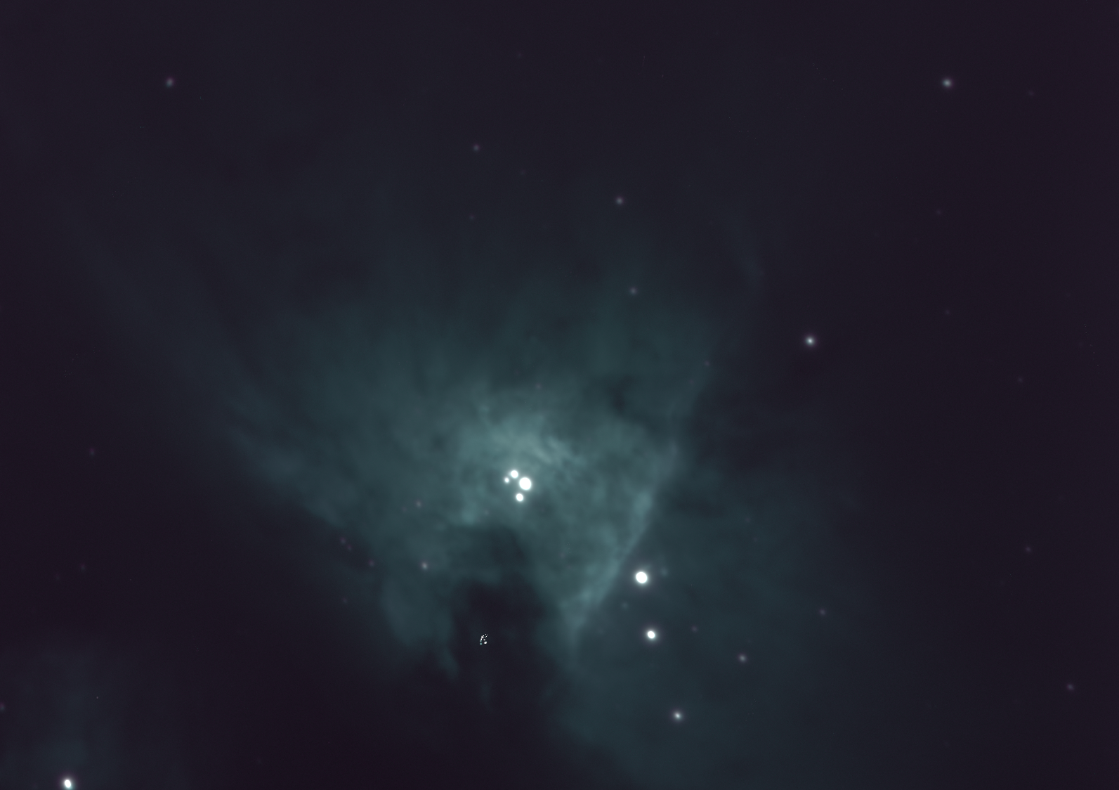
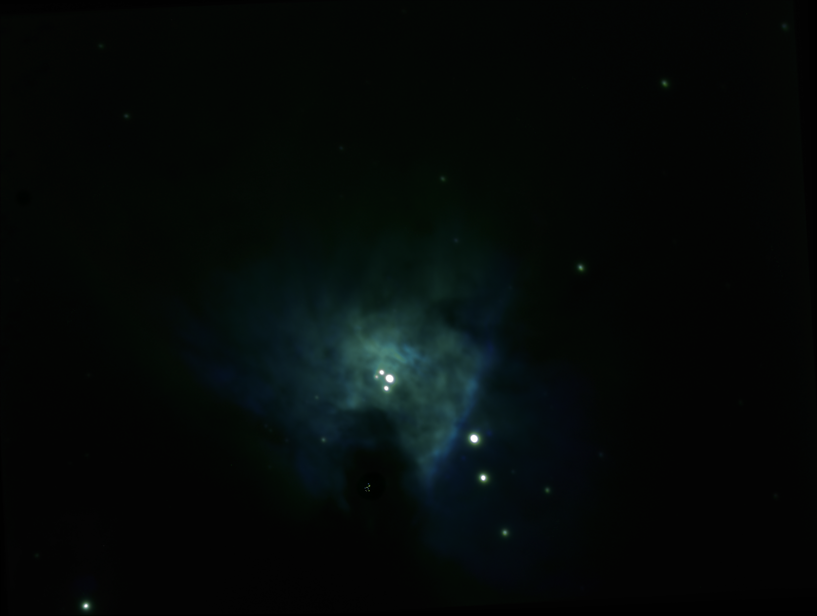
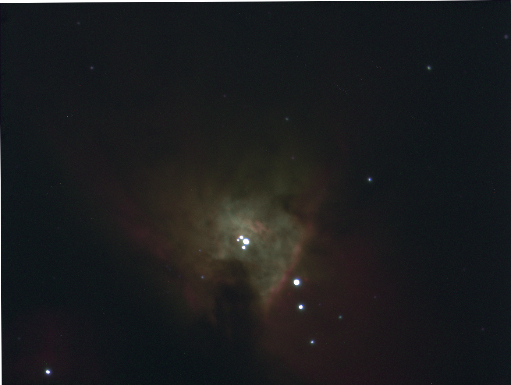
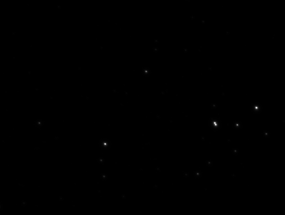
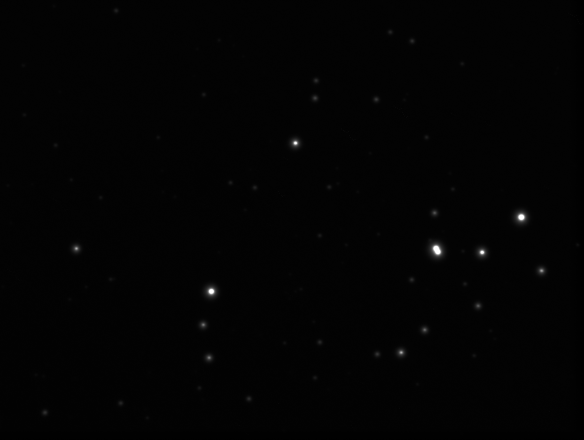
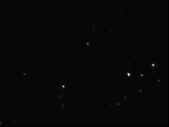
The first step was to find out how much the flux varies in our images of stars that are not undergoing a transit. From working on our HR diagram, we had 9 photos (of each filter) of Messier 47. A star was chosen at random and the standard deviation of photon counts for that star across all 9 B images was calculated, giving us a standard deviation of 0.094516 (as a fraction of total photon count) for a 20 second exposure.

Code:

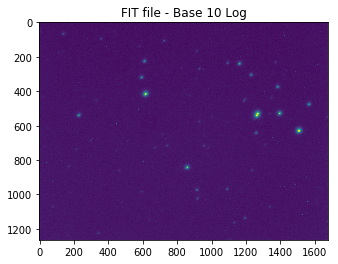
### 0. Locating objects in FIT file ###

import numpy as np, pandas as pd
import imageio
import matplotlib.pyplot as plt

from scipy import ndimage
from scipy import misc
from astropy.io import fits
from scipy.spatial import distance

from collections import namedtuple
import os

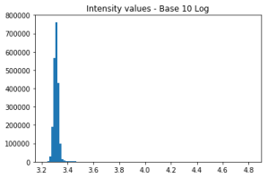
def total_intensity_image(input_voxels, threshold):
    voxels_copy = np.copy(input_voxels)
    threshold_indices = voxels_copy < threshold
    voxels_copy[threshold_indices] = 0
    return(voxels_copy.flatten().sum())

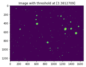
def threshold_image(input_voxels, threshold):
    voxels_copy = np.copy(input_voxels)
    threshold_indices = voxels_copy < threshold     voxels_copy[threshold_indices] = 0     plt.imshow(voxels_copy)     plt.title('Image with threshold at '+str(threshold))     plt.show()      def get_optimal_threshold(input_voxels, start=2, stop=9, num=300):     """     The optimal threshold is defined as the value for which the      second derivative of the total intensity is maximum     """     array = np.linspace(start,stop,num)     intensities = [total_intensity_image(input_voxels, i) for i in array]     array_deriv1 = array[2:]     intensities_deriv1 = [(y2-y0)/(x2-x0) for x2, x0, y2, y0 in zip(array_deriv1, array, intensities[2:], intensities)]     array_deriv2 = array_deriv1[2:]     intensities_deriv2 = [(y2-y0)/(x2-x0) for x2, x0, y2, y0 in zip(array_deriv2, array_deriv1, intensities_deriv1[2:], intensities_deriv1)]     return(array_deriv2[np.where(intensities_deriv2 == max(intensities_deriv2))]) GFiltering = namedtuple('GFiltering', ['filteredImage','segrObjects', 'nbrObjects' ,'comX', 'comY']) #defining named tuple containing (1) labeled voxels,\ #(2) integer number of different objetcs, (3) array of x-ccord of centers of mass for all objects, (4) same for y def gaussian_filtering(input_voxels, blur_radius):     # Gaussian smoothing     img_filtered = ndimage.gaussian_filter(input_voxels, blur_radius)     threshold = get_optimal_threshold(input_voxels)     # Using NDImage     labeled, nr_objects = ndimage.label(img_filtered > threshold) 

    # Compute Centers of Mass
    centers_of_mass = np.array(ndimage.center_of_mass(input_voxels, labeled, range(1, nr_objects+1)))
    array_com_x = [i[1] for i in centers_of_mass]
    array_com_y = [i[0] for i in centers_of_mass]
    
    return(GFiltering(img_filtered, labeled, nr_objects, array_com_x, array_com_y))


### 1. Retrieving coordinates and photons counts from a folder of fits files ###

# Take a single fits file, return data from with coordinates, sizes and photon counts of each star
def get_stars_from_fits(file):
    voxels = fits.open(file)[0].data
    data = gaussian_filtering(np.log10(voxels), 7) # This just find object locations, we won't actually use log10
    
    stars = []
    for star_label in range (1, data.nbrObjects + 1):
        objectCoord = np.where(data.segrObjects == star_label)
        zipped_list = np.array(list(zip(objectCoord[1], objectCoord[0], voxels[objectCoord])))
        
        coords = np.average(zipped_list[:,:2], axis=0, weights=zipped_list[:,2])
        size = len(objectCoord[0])
        photon_count = voxels[objectCoord].sum()
        
        stars.append({'coords': coords, 'size': size, 'photon_count': photon_count})
    return pd.DataFrame(stars)

# Repeat above function for an entire folder (returns list of DataFrame, each item being data from one image)
def get_stars_from_folder(folder):
    filenames = os.listdir(folder)
    data = []
    for filename in filenames:
        if '.fit' in filename:
            data.append(get_stars_from_fits(folder+filename))
    return data


### 2. Aligning images based on largest star so we can later match stars between files ###

# Get data from largest star in an image
def get_largest_star(image):
    return image[image['size'] == image['size'].max()].iloc[0]

# Get coordinates of largest star in image
def get_largest_star_coords(image):
    return get_largest_star(image).coords

# Take the full data set and return the image with most stars for calibrating against
def choose_calib_image(images):
    max_stars = max([image.shape[0] for image in images])
    return [image for image in images if image.shape[0]==max_stars][0]

# Take an image and align so largest star matches location with calibration image
def align_against_calib_image(image, calib_image):
    largest_star_coords = get_largest_star_coords(image)
    calib_image_coords = get_largest_star_coords(calib_image)
    
    image.coords = image.coords + calib_image_coords - largest_star_coords
    
# Take set of images and align them all against calibration image
def align_all_against_calib_image(images, calib_image):
    for image in images: align_against_calib_image(image, calib_image)
        
# Take the full data set, get all images, choose calibration images automatically and align all against it
def align_all_auto(images):
    align_all_against_calib_image(images, choose_calib_image(images))
    return images


### 3. Matching stars between multiple images to group into one DataFrame ###

# Get distance to all stars in file from specified coords. Outputs list of tuples (star object, distance)
def get_star_distances(coords, image):
    star_distances = [] # list of tuples: (star, distance)
    for i, star in image.iterrows():
        star_distances.append((star, distance.euclidean(coords, star.coords)))
    return star_distances

# Get closest star to particular coords in an image. Returns tuple (star object, distance)
def get_closest_star(coords, image):
    star_distances = get_star_distances(coords, image)
    smallest_distance = min([star_distance[1] for star_distance in star_distances])
    return [star_distance for star_distance in star_distances if star_distance[1]==smallest_distance][0]

# Take coordinates (x,y), and go through images selecting nearest stars. Ignore if too far away.
def find_matching_stars(coords, images, max_distance=10):
    closest_stars = []
    for image in images:
        (star, distance) = get_closest_star(coords, image)
        if distance < max_distance:
            closest_stars.append(star)
    return {'coords': coords, 'closest_stars': pd.DataFrame(closest_stars)}

# Returns list of tuples (x,y) of star coordinates from an image
def list_all_coords(image):
    return [star.coords for i, star in image.iterrows()]

# Repeat find_matching_stars for all stars in a file, output pandas DataFrame
def match_all_stars(image, images, max_distance=10):
    full_star_list = []
    for coords in list_all_coords(image):
        matching_stars = find_matching_stars(coords, images, max_distance)['closest_stars']
        if len(matching_stars) == len(images): # Only include stars found in all files
            full_star_list.append({'coords': coords, 'matched_stars': matching_stars})
    return pd.DataFrame(full_star_list)

# Same as match_all_stars but takes entire data set and chooses calibration files by itself
def match_all_stars_auto(images, max_distance=10):
    images = align_all_auto(images)
    return match_all_stars(choose_calib_image(images), images, max_distance)


### 4. Finally retrieving the data we actually want ###

def aggregate_star_data(images):
    data = match_all_stars_auto(images)
    
    stars = []
    for i, star in data.iterrows():
        coords = tuple(star.coords)
        photon_counts = star.matched_stars.photon_count.values
        sizes = star.matched_stars['size'].values # Had to use [''] notation because of my stupid naming
        stars.append({
            'coords': coords,
            'avg_photon_counts': np.mean(photon_counts),
            'avg_size': np.mean(sizes),
            'standard_deviation_photon_counts': np.std(photon_counts),
            'coeff_of_var_photon_counts': np.std(photon_counts) / np.mean(photon_counts)
        })
    return pd.DataFrame(stars)

folder = 'FIT_Files/' # Make sure to include '/' after folder name
data = get_stars_from_folder(folder)
aggregate_star_data = aggregate_star_data(data)
aggregate_star_data.to_csv('CSV/combined_star_data.csv') # Save the data for use later
aggregate_star_data

Step 2: Finding a functional form for light curves

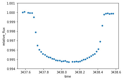
Next, to help generate functions for simulating a transit, data was taken from a transit of HIP 41378, which was observed by the Kepler space telescope (https://archive.stsci.edu/k2/hlsp/k2sff/search.php, dataset K2SFF211311380-C18). This shows how flux changes over a few days. At around 3439 days, there is a clear dip in the data where a transit took place:

1

Zooming in on this dip, we start to see the shape of the “light curve” we are looking for:

2

After a bit of trial and error and help from Malcolm, a curve was fitted over this which could be used for simulations.

3

The formula for the curved part finally came out as
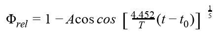
Screenshot from 2019-03-19 16-42-55

where

  • Φrel = Relative flux (1.0 being flux when no transit)
  • A = Amplitude (maximum dip in relative flux)
  • T = Length of time of transit (days)
  • t = time (days)
  • t0 = Time of minimum flux (i.e. time halfway through transit)

With this equation, the parameters can now be varied as we like.

Code:


### 0. Imports ###

import pandas as pd
import numpy as np
import matplotlib.pyplot as plt
import os


### 1. Get some sample data from an actual exoplanet transit ###

# Read the data and plot the relative flux over time
filepath = 'Kepler_Data/test-light-curve-data.csv'
sample_data = pd.read_csv(filepath)
sample_data = sample_data.rename(index=str, columns={"BJD - 2454833": "time", "Corrected Flux": "relative_flux"})
sample_data.plot(x='time', y='relative_flux')

# zooming in to the transit (secton with big dip) and normalising so flux starts at 1.0
start_time = 3437.55
end_time = 3438.61
transit_data_length = end_time - start_time#

sample_data = sample_data.drop(sample_data[(sample_data['time'] < 3437.55) | (sample_data['time'] > 3438.61)].index)
sample_data['relative_flux'] = sample_data['relative_flux'] / sample_data['relative_flux'][0]
sample_data.plot.scatter(x='time', y='relative_flux', ylim=[0.994, 1.001])

# Adjusting to start at time=0
sample_data['time_adjusted'] = sample_data.time - start_time
sample_data.plot.scatter(x='time_adjusted', y='relative_flux', ylim=[0.994, 1.001])


### 2. Creating a functional form for this data ###

## 2.1 Fitting a curve to the data##

# Just a quick function to help in the formula below
# Return x^exponent if x>=0, (-x)^exponent if x<0 def real_power(x, exponent):     if x >= 0: return x**exponent
    else: return -(-x)**exponent

relative_flux_range = relative_flux_range = max(sample_data.relative_flux) - min(sample_data.relative_flux)
time = np.arange(0.0, transit_data_length, 0.01)
time_centre_of_transit = transit_data_length / 2

# After fiddling around the below formula seems to fit for during the transit (but not outside)
relative_flux_curve = [1.0 - relative_flux_range*(real_power(np.cos((4.2*(x-time_centre_of_transit))), 0.2)) for x in time]

transit_curve = pd.DataFrame({'time': time, 'relative_flux': relative_flux_curve})
# Set all points outside of the transit to 1.0
transit_curve.loc[transit_curve['relative_flux'] > 1, 'relative_flux'] = 1.0

ax = transit_curve.plot(x='time', y='relative_flux')
sample_data.plot.scatter(ax=ax, x='time_adjusted', y='relative_flux', color='orange')


## 2.2 Switching to units of seconds and photons per second ##

expected_photons_per_second = 80000 # This is a random choice for now but not far off true data we'll use
seconds_in_day = 86400

# Convert time from days to seconds
transit_curve['time_seconds'] = list(map(int, round(transit_curve.time * seconds_in_day)))

# We only generated data for each 0.01 days, let's fill the curve for every second
def interpolate_transit_curve(curve):
    # Start with list of empty data points
    time_range = max(curve.time_seconds)
    data = pd.DataFrame({'time_seconds': list(range(0, time_range + 1))})
    relative_flux = [None] * (time_range + 1)

    # Fill each row that we have data for
    for index, row in curve.iterrows(): # Populate data we have
        relative_flux[np.int(row.time_seconds)] = row.relative_flux 
    
    if not relative_flux[0]: relative_flux[0] = 1.0
    if not relative_flux[-1]: relative_flux[-1] = 1.0
    
    data['relative_flux'] = relative_flux
    
    # Fill in the gaps
    data = data.interpolate()
    
    return data

adjusted_transit_curve = interpolate_transit_curve(transit_curve)

# Changing y axis to photons per second
adjusted_transit_curve['photons_per_second'] = adjusted_transit_curve.relative_flux * expected_photons_per_second

adjusted_transit_curve.plot(x='time_seconds', y='photons_per_second')


### 3. Putting this all into python functions ###

# Change units to seconds and photons per second
def change_transit_curve_units(transit_curve, expected_photons_per_second):
    transit_curve['time_seconds'] = list(map(int, round(transit_curve.time * seconds_in_day))) # Convert time from days to seconds
    adjusted_transit_curve = interpolate_transit_curve(transit_curve) # Fill in missing data
    adjusted_transit_curve['photons_per_second'] = adjusted_transit_curve.relative_flux * expected_photons_per_second # Changing y axis to photons per second
    return adjusted_transit_curve

def curve_formula(x, relative_flux_range, transit_length_days):
    time_centre_of_transit = transit_length_days / 2
    cos_factor = (1.06 / transit_length_days) * 4.2 # This is just variable used in the equation for the curve
    
    # After fiddling around the below formula seems to fit for during the transit (but not outside)
    return 1.0 - relative_flux_range*(real_power(np.cos(cos_factor*(x-time_centre_of_transit)), 0.2))

# transit_length (in seconds) actually slightly longer than actual transit - includes some flat data either side
# expected_photons_per_second is for when no transit taking place
# relative_flux_range is the amount we want the curve to dip

def get_transit_curve(transit_length, expected_photons_per_second, relative_flux_range):
    second_in_day = 86400
    transit_length_days = transit_length / seconds_in_day
    time = np.arange(0.0, transit_length_days, 0.001) # List of times to fill with data points for curve
    
    relative_flux_curve = [curve_formula(x, relative_flux_range, transit_length_days) for x in time]
    transit_curve = pd.DataFrame({'time': time, 'relative_flux': relative_flux_curve})
    
    # Set all points outside of the transit to 1.0
    transit_curve.loc[transit_curve['relative_flux'] > 1, 'relative_flux'] = 1.0
    
    return change_transit_curve_units(transit_curve, expected_photons_per_second)

# Just a test. This is closer to what we'll be observing
get_transit_curve(10000, 80000, 0.0025).plot(x='time_seconds', y='photons_per_second')

Step 3: Simulating the observation of a transit

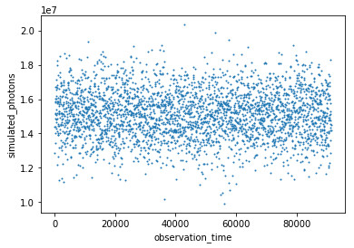
The first simulation was done using the parameters for the transit above: T = 1.06 days, A = 0.0053475. A data point was generated for every 30 seconds of data, simulating the photon count for a 20 second exposure based on the given curve. The data point was then shifted randomly up or down based on a normal distribution around that point with the standard deviation taken from part 1 above. In theory, we should have seen the data points dip and rise (in similar fashion to the curve they were generated from), but given the very large standard deviation relative to the change in flux, they came out looking quite random:

4

Step 4: Testing the data

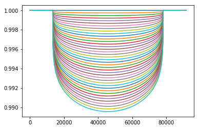
The question must now be asked: Does this data show anything, or is it just a random mess? To test this, we take a selection of curves of varying amplitudes (from zero change in flux to twice that of the expected change), and test which curve our data fits best against. Ideally, we end up with it fitting closest to the one in the middle (the amplitude we started with for our simulation).

5

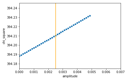
For each curve, a chi-square test was done, comparing the simulated data to the curve. The chi-square statistic is defined as

Screenshot from 2019-03-19 16-55-26

where observedk are our simulated data, and expectedk are the expected data points taken from a curve. σ is the standard deviation.

In general, the lower the chi-square stat, the closer our data fits the model. So, what we hope to see as we vary our amplitude is that the chi square stat decreases (as amplitude increases from zero), hits a minimum at our “good” amplitude (about 0.05, which the data was generated from), and then begins to increase again as the amplitude grows larger. It turns out this is exactly what we saw! The orange line represents the amplitude we were hoping for:

6

It appears that the best fit for the random-looking simulated data is indeed the curve we were hoping for. This is good news for our chances of observation, but unfortunately this simulation was a bit unrealistic for our purposes: The upcoming transits that Mohyudding has found for us that we are hoping to observe are less than three hours long (the one above is closer to 25), and the dip in flux is around 0.25%, rather than 0.5%. Rerunning the simulation and chi-square testing with a 170 minute transit and amplitude of 0.0025, we get a slightly different result:

7

This isn’t too bad – it indicates that we would still detect the dip in flux, but perhaps would not be able to accurately measure the amount of dip (in this case it would have been over-estimated).

Unfortunately, there was still one final kick in the teeth awaiting us: The stars we are likely to observe are of around magnitude 11 (very dim). It seems that the dimmer the star, the worse our error in measurement. When retesting with the standard deviation of a magnitude 9 star (less dim, but still quite dim), we get this result:

8

Oh dear! This result implied that no amplitude (i.e. no transit at all) would be a better fit than any dip in flux, let alone the exact dip we were hoping for. Unfortunately, it seems that our errors are just too large to detect a transit accurately.

In conclusion, it seems that detected an exoplanet transit is going to be quite a challenge. We haven’t completely given up hope though: If we are lucky enough to have a clear sky on the right night, we might try to observe a transit using much longer exposure photographs. This will hopefully allow us to reduce the error in our readings.

Code:

### 0. Imports and constants ###

import pandas as pd
import numpy as np
import matplotlib.pyplot as plt
import os

seconds_in_day = 86400

# Data taken from star 14 in file A-luminosity-standard-deviations.ipynb
test_expected_photons_per_second = round(15158415.7/20)
test_standard_deviation = 1432719

# Data from the imported Kepler data in file B-exoplanet-transit-curve-function.ipynb
test_transit_time = 91584
test_relative_flux_range = 0.0053475457296916495


### 1. Functions to generate curves for simulating transits ###

# (mostly just copied from previous section) #


def interpolate_transit_curve(curve):
    # Start with list of empty data points
    time_range = max(curve.time_seconds)
    data = pd.DataFrame({'time_seconds': list(range(0, time_range + 1))})
    relative_flux = [None] * (time_range + 1)

    # Fill each row that we have data for
    for index, row in curve.iterrows(): # Populate data we have
        relative_flux[np.int(row.time_seconds)] = row.relative_flux 
    
    if not relative_flux[0]: relative_flux[0] = 1.0
    if not relative_flux[-1]: relative_flux[-1] = 1.0
    
    data['relative_flux'] = relative_flux
    
    # Fill in the gaps
    data = data.interpolate()
    
    return data

# Change units to seconds and photons per second
def change_transit_curve_units(transit_curve, expected_photons_per_second):
    transit_curve['time_seconds'] = list(map(int, round(transit_curve.time * seconds_in_day))) # Convert time from days to seconds
    adjusted_transit_curve = interpolate_transit_curve(transit_curve) # Fill in missing data
    adjusted_transit_curve['photons_per_second'] = adjusted_transit_curve.relative_flux * expected_photons_per_second # Changing y axis to photons per second
    return adjusted_transit_curve

# Used for the formula version of transit curve. Returns x^n if x>=0, -(-x)^n if x<0 def real_power(x, exponent):     if x >= 0: return x**exponent
    else: return -(-x)**exponent
    
def curve_formula(x, relative_flux_range, transit_length_days):
    time_centre_of_transit = transit_length_days / 2
    cos_factor = (1.06 / transit_length_days) * 4.2 # This is just variable used in the equation for the curve
    
    # After fiddling around the below formula seems to fit for during the transit (but not outside)
    return 1.0 - relative_flux_range*(real_power(np.cos(cos_factor*(x-time_centre_of_transit)), 0.2))

# transit_length (in seconds) actually slightly longer than actual transit - includes some flat data either side
# expected_photons_per_second is for when no transit taking place
# relative_flux_range is the amount we want the curve to dip

def get_transit_curve(transit_length, expected_photons_per_second, relative_flux_range):
    transit_length_days = transit_length / seconds_in_day
    time = np.arange(0.0, transit_length_days, 0.001) # List of times to fill with data points for curve
    
    relative_flux_curve = [curve_formula(x, relative_flux_range, transit_length_days) for x in time]
    transit_curve = pd.DataFrame({'time': time, 'relative_flux': relative_flux_curve})
    
    # Set all points outside of the transit to 1.0
    transit_curve.loc[transit_curve['relative_flux'] > 1, 'relative_flux'] = 1.0
    
    return change_transit_curve_units(transit_curve, expected_photons_per_second)


### 2. Simulating observing a transit ###


def get_simulated_data(transit_curve, standard_deviation, observation_frequency=30, exposure_time=20):
    observation_times = list(range(0, transit_curve.shape[0]-exposure_time, observation_frequency))
    expected_photons, simulated_photons = [], []
    
    coeff_of_variation = standard_deviation / (max(transit_curve.photons_per_second)*exposure_time)

    for observation_time in observation_times:
        end_observation_time = observation_time + exposure_time
        curve_rows = transit_curve.loc[(transit_curve['time_seconds'] >= observation_time) & (transit_curve['time_seconds'] < end_observation_time)]         expected_photons_observed = int(np.sum(curve_rows.photons_per_second))         simulated_photons_observed = round(np.random.normal(expected_photons_observed, expected_photons_observed*coeff_of_variation))         expected_photons.append(expected_photons_observed)         simulated_photons.append(simulated_photons_observed)              return pd.DataFrame({         'observation_time': observation_times,         'expected_photons': expected_photons,         'simulated_photons': simulated_photons     }) test_curve = get_transit_curve(test_transit_time, test_expected_photons_per_second, test_relative_flux_range) test_simulated_data = get_simulated_data(test_curve, test_standard_deviation) test_simulated_data.plot.scatter(x='observation_time', y='simulated_photons', s=1) ### 3. Chi-square testing ### ## 3.1 The functions for chi-square stat and generating curves of varying amplitude ## # Get chi-square stat def get_chi_square(data, transit_curve, standard_deviation, observation_frequency=30, exposure_time=20):     observation_times = data.observation_time          expected_photon_counts_from_curve = []       for observation_time in observation_times:         end_observation_time = observation_time + exposure_time         curve_rows = transit_curve.loc[(transit_curve['time_seconds'] >= observation_time) & (transit_curve['time_seconds'] < end_observation_time)]
        expected_photon_counts_from_curve.append(int(np.sum(curve_rows.photons_per_second)))
        
    simulated_photon_counts = data.simulated_photons
    
    variance = standard_deviation**2
    chi_square = np.sum(np.square(simulated_photon_counts - expected_photon_counts_from_curve)) / variance
    
    return chi_square

# Generate list of transit curves, all paramters kept the same except amplitude (demonstrated below)
def get_curves_to_compare_against(transit_length, expected_photons_per_second, expected_relative_flux_range, number_of_curves=40):
    curves = []
    for flux_range in np.arange(0, expected_relative_flux_range*2, (expected_relative_flux_range)*2/number_of_curves):
        curves.append(get_transit_curve(transit_length, expected_photons_per_second, flux_range))
    return curves

# Get list chi squares for simulated data tested against varying curves
def get_multiple_chi_squares(data, transit_length, expected_photons_per_second, relative_flux_range, standard_deviation, number_of_curves=40):
    curves = get_curves_to_compare_against(transit_length, expected_photons_per_second, relative_flux_range)
    
    chi_square = []
    amplitude = []
    for curve in curves:
        chi_square.append(get_chi_square(data, curve, standard_deviation))
        amplitude.append(max(curve.relative_flux) - min(curve.relative_flux))
    
    return pd.DataFrame({'chi_square': chi_square, 'amplitude': amplitude})


## 3.2 Testing these out with the paramaters used for the actual transit in file B ##

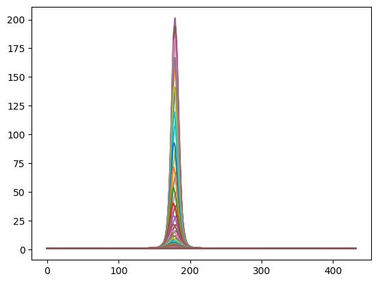
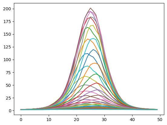
# A demonstration showing all the curves I am comparing the simulated data against
curves = get_curves_to_compare_against(test_transit_time, test_expected_photons_per_second, test_relative_flux_range)
for curve in curves: plt.plot(curve.time_seconds, curve.relative_flux)
    
test_chi_square_df = get_multiple_chi_squares(test_simulated_data, test_transit_time, test_expected_photons_per_second, test_relative_flux_range, test_standard_deviation)

test_chi_square_df.plot.scatter(x='amplitude', y='chi_square')
plt.xlim([0, 0.011])
plt.axvline(x=test_relative_flux_range, color='orange')


## 3.2 Testing with more realistic parameters ##

# Similar to my previous simulated data but with much fewer points due to less time to observe
transit_time = 10000 # Rounded up to account for the flat parts of the curve at either end
relative_flux_range = 0.0025
transit_curve = get_transit_curve(transit_time, test_expected_photons_per_second, relative_flux_range)
simulated_data = get_simulated_data(transit_curve, test_standard_deviation)
simulated_data.plot.scatter(x='observation_time', y='simulated_photons', s=1)

chi_square_df = get_multiple_chi_squares(simulated_data, transit_time, test_expected_photons_per_second, relative_flux_range, test_standard_deviation)
chi_square_df.plot.scatter(x='amplitude', y='chi_square')
plt.xlim([0, 0.007])
plt.axvline(x=relative_flux_range, color='orange')


## 3.3 Testing with worse standard deviation ##

standard_dev = 3*test_expected_photons_per_second*20
x_simulated_data = get_simulated_data(transit_curve, standard_dev)
x_simulated_data.plot.scatter(x='observation_time', y='simulated_photons', s=1)

chi_square_df = get_multiple_chi_squares(x_simulated_data, transit_time, test_expected_photons_per_second, relative_flux_range, standard_dev)
chi_square_df.plot.scatter(x='amplitude', y='chi_square')
plt.xlim([0, 0.007])
plt.axvline(x=relative_flux_range, color='orange')

Telescope Project 2019

Hello! We are the telescope team of 2019! We are Aman, Paul, Victor, Ki, Tim, Mohyuddin and of course, Malcolm!

The purpose of this blog will be to keep a log of what we’ve been up to on a regular basis, and hopefully form a nice basis for the dreaded report.

Over the past few weeks we have been working on creating a Hertzsprung-Russell diagram of the Messier 47 star cluster. A HR diagram is a graph that plots stars according to their luminosity and colour. Using this diagram we are able to identify a star’s type depending on its position on the diagram.

Even more, by looking at the turn off point (the point where main sequence stars become red giants) we are able to figure out the cluster’s age.

In order to do this we first needed to get a number of images to work with.  In the observatory we managed to take 20 pictures of Messier 47. 10 of these were taken with a blue filter and the other 10 with a green filter.

The reason for taking these two sets of images are to allow us to calculate a B-V colour index, fulfilling one of the axis requirements for the HR diagram.

The next stage was for us to take the images and merge them into one. But first we had to get rid of ‘hot pixels’. These are bright points in our images caused by defects in the cameras system. Below is an example image – if you look closely you can very bright and very small dots. These are hot pixels, not stars!

An image we have taken of Messier 47. If you look closely enough you can see the tiny, but bright, hot pixels.

We first attempted processing the images by hand.  We removed the hot pixels by painting them out in GIMP, an image manipulation program. We then layered all the corresponding B and G images on top of each other and merged them using the ‘addition’ blending channel. Unfortunately, since the telescope was not perfectly still when it was taking the photos, you could see a significant directional blur. To remedy this we had to align all the images manually by eye. Below is what resulted.

This is the result of aligning and merging all 10 blue filter images of M47 in GIMP

Same as above but with the green filter instead.

While it was sufficient for our purposes, we decided that this approach was far too labour intensive. If we managed to go up again a take even more pictures, we’d have to repeat the whole tedious process. Instead it would be better to handle all this using the magic of python!

By working with the FITS files through python we hoped to automate the whole process.

We first converted the files into arrays and then took the logarithms of the intensity values. This gave the images a better contrast allowing us to see far more stars.

The raw FITS file

The same file but with a logarithm applied

However after taking the logarithm we were left with images with significant noise. The next step was to set a threshold intensity. Any value below this threshold would be changed to 0, and as a result we should be left with only stars and some hot pixels. We determined the optimum threshold value by taking the maximum of the second derivative of the total intensity.

Intensity values within a FITS file of M47

A graph of the 2nd derivative

For this image we found the optimum threshold intensity value to be 3.38.

The determined threshold applied to the log10 FITS file.

Since what we now had was just an array of points with different intensities, the next step was to cluster them into their own star arrays. First we used a Gaussian blur to smooth out the objects. This also had the additional benefit of blurring away the hot pixels.


Here is a Boolean test demonstrating the thresholding applied to the image. Notice all the noise and jagged shape of the stars.

But with the Gaussian blur applied we have a cleaner image with much smoother objects.

Here we have an even larger blurring radius applied.

The next step was to cluster pixels into their own groups of stars. This was accomplished with the ndimage.label function.

Here are the segregated objects. Each star has its own unique colour, indicating that it’s has it’s own distinct label.

Now that we had separated the intensities into their own stars, we could then work out the centre of masses for each one.

Centres of masses applied to the clusters

Centre of masses isolated

With the pre-processing complete, we could now work on automating the alignment of all the images with respect to each other.

Memories of David Bailin, by G. V. Kraniotis

This lovely tribute was sent to me by fellow Bailin PhD student George Kraniotis who was unable to come to the memorial today.

My memories of David Bailin are many and still vivid in my mind since I spent 12 exciting and very productive years with him in United Kingdom. Firstly, he was my  M.Sc. and D. Phil. supervisor at Sussex University during the period 1990-1995. The second phase of our collaboration (1996-2002) started in 1996  when I was hired by Alexander Love as a postdoctoral research assistant at Royal Holloway  University of London and continued later at Sussex university (2001-2002).   During the second phase the three of us formed a very strong research team. We published 16 original papers (12 in Physics Letters B,  2 in Nuclear Physics B and 2 in JHEP) in the fields of string phenomenology and cosmology.

Let me start with my first personal memories of David. When I was finishing my first degree at Ioannina University in Greece, I decided to start my research in string theory since I was aware, after reading a popular science article, that the theory of strings was attempting to reconcile General Relativity with Quantum Mechanics. At the same time, I had understood from my undergraduate courses that although the Standard Model of particle physics was a successful theory, yet it was not a complete story since it could not predict the mass of the electron and gravity was out of its realm. After making a personal bibliography research in Greece I realised that David Bailin was one of the world experts in this new theory. Thus I decided to apply at Sussex University for my postgraduate studies with the hope that David will become my supervisor. After I received a formal offer from the University of Sussex to enroll as an M.Sc. student  on October the 2nd 1990 I travelled to Brighton. During the first week as a student I had to meet with the faculty members and find a supervisor for my M.Sc. dissertation. When I first met David I remember his welcoming smile and how polite person he was. He asked me various things about my background and then he asked me why I want to work with superstrings. I told him I am aware that the theory involves very advanced branches of mathematics however I am interested in finding out through my research about its physical relevance in Nature. Immediately David gave me to read his article entitled Why Superstrings? and we decided to meet every week to discuss my progress for the topic of my M.Sc. dissertation on string theory. I was quite pleased of course. Our common journey for the next 12 years had just started. Besides introducing me to the world of superstrings David during these first days introduced me also to the world of coffee! In our first meeting after the initial encounter he asked me if I want to drink a coffee. I was shy to tell him that I was not drinking coffee so I accepted his kind offer. To my surprise the instant coffee he made me was so tasty that since that day I joined the club of coffee lovers! He was a modest person despite the fact he was a famous theoretical physicist. He was a great teacher. Very direct with his students he asked me from the first days to call him David and not Professor Bailin.  Initially it was not easy for me due to my academic undergraduate background in Greece but eventually I got used to it. He was very smart and very perceptive of the needs of his students. He inspired confidence with his knowledge and with his penetrating questions he immediately was able to have a picture of the student’s progress.  I remember in February of 1991 Dr. Copeland the person responsible at Sussex at that period for the academic postgraduate admissions he asked me to meet with him in David’s office to discuss about the perspectives for me to enroll as a D.Phil, student after completing my M.Sc. course especially the financial issues. Initially we discussed about such formalities and when I thought the meeting had ended David asked me to go to blackboard and explain to both of them what I have had learned so far about string theory. I was quite surprised, and unprepared nevertheless I started writing equations on the blackboard. At some stage I mentioned that  is the critical spacetime dimension of the bosonic string. David asked me to give some arguments about this. I started giving arguments about the absence of ghost states for ,  but then David told me but why exactly 26. I was at a loss for a few moments but then I recovered and explained that consistent quantization of the theory and the conformal symmetry (cancellation of anomalies) required the critical spacetime dimensionality to be exactly 26. After the end of the meeting (examination in fact) I learned from David that I was accepted for a D.Phil. position and he told me I did well in the board especially in the question about the dimensionality of the bosonic string.  My M.Sc. project was to derive a particular Grand Unified theory the so called flipped    model in the fermionic formulation of strings as formulated by Kawai et al. This project required among other things mastering the basics of group representation theory something I did pretty fast but also knowledge of number theory. In particular the derivation of the particle spectrum from the formulation required solving systems of congruences something it was completely new to me. I remember the enigmatic smile of David when I first asked him about congruences: he told me don’t you know about congruences ? It took me some effort to be able to learn solving them. I derived most of the spectrum but there were still  some more involved cases that needed to be solved. David was quite rigorous and demanding and he told me  you must solve all congruences and then you will start writing up your dissertation. After a few days I return in triumph to David who was pleased and he gave me the go ahead for the completion of the dissertation.

In my D.Phil. years David gave me enough space for doing independent research. He was always encouraging me to leave my mark in research but at the same time he was very supportive when it was necessary to calm me down. I learned programming from scratch. I remember David telling me when I first realized that some numerical analysis  was needed in my project: George leave the calculations in paper for the moment, it is time to learn how to produce software in order to solve your renormalization group differential equations! On the other hand  he was quite generous in his comments when he realized that a real progress was taking place. When I had published my second paper  on the constraints the observed flavour changing neutral current process  was imposing on the physical parameters of the effective supergravity from heterotic string theory he told me: George you realise that this is real life you are talking about! We celebrated the award of my D.Phil. in a Greek restaurant with live music in Brighton, David his wife  Anjali, my parents and I and many of my friends in Brighton.  At this point I must mention an interesting coincidence in our lives: both our fathers were tailors in profession his father’s first name was William which in Greek is usually interpreted to correspond to Vassilios my father’s first name!

During my postdoctoral years I had a very intensive interactive time with David and his long-term collaborator Alex Love.  I remember vividly our trip to Philadelphia USA for the conference SUSY97. This was my first trip to USA. I was so excited. During this conference we completed (adding the final touches) our first fundamental  paper on CP violation by soft supersymmetry breaking terms in orbifold compactifications and we uploaded a first version to arXiv. We were both very pleased with our results and we celebrated in an exclusive restaurant in the city. David took a nice photo of me sitting next to the well known statue of Benjamin Franklin on a bench of Philadelphia.

On the same trip I remember David expressing his firm belief on the European Community. It was Sunday morning and we had a time to spare. We took a walk on the urban Philadelphia. Near a music record shop I was mesmerised by the captivating music of Kind of Blue by Miles Davis. I told that to David so we went inside the shop to buy the cd. The seller when he understood David was an Englishman he told him that he could not  understand how UK is a member of European Community since it has such a closed relationship with USA. David he responded: UK being a member of EU is able to hire people such as George here- showing me, from other  EU member states ( such as Greece) who can contribute to the advancement of knowledge! The American citizen said no more!

David was very observant on the comments of his collaborators and friends. During the visits of me and Alex Love to him at Sussex for a research collaboration we used to take our lunch in the Falmer pub together with a pint of beer. On one occasion as that, the discussion involved the star wars program of USA in the era of Ronald Reagan presidency.  David and Alex were quite critical of the project in general. In a surprising note to them I responded saying that perhaps the reason that the star war program was launched was not only military as a response to the cold war era but that the USA leaders of the project  also had in mind the development of a defense system against a possible encounter with a large comet or asteroid that could threat Earth. David told me that I have similar ideas to Sir Fred Hoyle and he recommended to read the book by the latter:     Origin of the Universe and the Origin of Religion (Anshen Transdisciplinary Lectureships in Art, Science, and the Philosophy ) 

A book that I really enjoyed.  This is an example of how the interaction between physicists even at relaxation moments can reveal and inspire new avenues of scientific thought. Especially nowdays the relevance is more evident since astrobiology has become a new fundamental scientific discipline in the enquiries of humans on the origins of life.

He loved the Sussex surroundings very much. Besides long walks he enjoyed taking pictures of the beautiful English hill landscape around Falmer at different periods of the year in order to capture the changes of Nature at different seasons.

We also many times enjoyed the company of each other in his Hove house drinking ouzo and eating fish eggs (fish roe) a kind of caviar specialite from Vonitsa  (my father’s hometown)  that my father was sending me to England occasionally. Other times we spent quality time in pubs and restaurants in Hove and Brighton. On one occasion the physics department had a dinner party in a Brighton restaurant. Each one of us had the right to bring his own drinks.  I brought a bottle of a very good red wine.  I thought the waiter would open the bottles on table. Instead he took all bottles to open them in a separate place. I was worried but did not say anything. David  read my mind and he said: George you worry that he will change the content of the bottle.  He spontaneously  laughed.

Our published work involved not only elementary number theory but also advanced analytic number theory such as the modular functions that were appearing in the effective supergravity Lagrangian that was consistent with modular invariance. Modular forms became a highly interesting topic for me so the field of number theory and its relation to physics became one of the subjects I got really engrossed.  David invited my wife Rania and me to his house in Hove a number of times to enjoy the delicious Indian food prepared with love by Anjali. On one of these  social occasions he gave me as present the book:
The Man Who Loved Only Numbers: The Story of Paul Erdös and the Search for Mathematical Truth by Paul Hoffman. I really enjoyed and have used it many times to inspire my students when I want to present examples of dedication and excellence.

Many times I enjoyed drinking tea with David in his house by the garden in Hove. Quite often in these tea breaks we discussed about the applications of number theory in cryptography  bringing as an example and sharing information about the  Enigma Machine and how the cryptologist’s team in Bletchley Park finally broke the code.

David encouraged my inclination to number theory aspects in many ways.  When our paper in The Effect of Wilson line moduli on CP violation by soft supersymmetry breaking terms  got published in Physics Letters B a week after its submission all three members of our research team were so pleased. It was a highly original and technical paper. In this paper the Igusa cusp form of genus two was involved in the construction of the effective supergravity  Lagrangian. The  original use of this highly non-trivial function for the first time in the string theory literature was certainly a reason for some pride for the achievement. David once more was very generous in his comments to me by telling me: George, there are only two physicists in the world who are really experts in these Igusa functions, you and a colleague of ours in Germany (S.Stieberger). The latter had been cited in our work.

In summer 1998  we shared some very beautiful moments in Oxford in a conference there (SUSY 98).  Besides the exciting scientific part of our visit we spent some quality time there together with colleagues and friends in the local pubs and cafes discussing physics enjoying the atmosphere of Oxford. David emitted a kind of beautiful warmth with his acquaintances and friends. As a part of the social program of the conference we attended an opera in the city. Before the start of the performance I noticed a luxurious chair in the middle of the scene. Being in a good humour I asked David for who is this chair? David being also in a good humour he replied: for you! We both smiled happily and enjoyed the rest of the evening.

In spring of 2000, I spent a month at Cern with David as a visiting scientist. During this month we completed a PLB paper: CP violation including universal one loop corrections and heterotic M theory . Besides work we had time for enjoying ourselves. I remember vividly dinning with David in Café de Paris restaurant in Geneva where we ate very high quality beef steaks.  I enclose a picture of me and David from this night. We also enjoyed walking in the surrounding mountains with the company of other colleagues. I enclose two pictures from such mountain walks. In the photos besides David and me appear two other ex students of David: Thomas Dent and Malcolm  Fairbairn.

In the years 2001-2002 we produced and published some pioneering and influential work in the exciting  field of intersecting Dirichlet branes. Specifically,  we produced semi-realistic standard-like models in the context of the large extra dimensions string gravity scenario. I believe we were the first group that  solved analytically in a general way the string tadpole equations and the constraints arising from a generalised Green-Schwartz anomaly cancellation mechanism.

Besides being my supervisor, mentor, teacher, research collaborator, a friend,  David he was also my best man. He was the best man  together with Phil Valder in my marriage with Ourania Kraniotis  in a beautiful ceremony in Weybridge Register Office /Surrey County Council on October the 18th 2001. All of us have very fond memories of that day. I sent some photos from this happy day. When we received the marriage certificate David told us both: never lose it! David was also very happy when our son Vassilis was born in Brighton!

Many times in our informal discussions David had mentioned that a professional physicist in his career  must necessarily spend some time working in USA  in order to gain experience on how US physicists collaborate in doing research. Indeed, after my research experiences in USA working as a postdoctoral research fellow at Texas A&M university in the period 2004-2006 , I couldn’t agree more (with David).

In 2010 David introduced me to the world of Facebook! We became friends in the platform and many times we exchange personal communication there. I remember how happy I felt when I received a like from David for my uploads. Especially each time he added a like on my scientific uploads sharing my recent publications in gravitational physics and black holes constituted an additional gratification for me!

In retrospect I feel very lucky that I met David and spent twelve exciting years with him in United Kingdom. On the other had I feel sad and regret that after I left England in April 2002 I never met in person with David again. Of course we had frequent communication exchanging emails and latter messages in Facebook but still this cannot substitute the personal live contact. Many times humans make the mistake to believe that their beloved ones will always be physically around. Especially when their beloved ones  have been  larger than life as David was. Unfortunately life is cruel in this respect. David left us suddenly last March, resting now in a neighbourhood of Stars.  However, people never die as long as their living beloved ones keep remembering them. I will miss you dearly David and I will honour your memory forever.


David Bailin 1938-2018 (My Talk in his memory)

I’ve been putting off this particular blog post.  In March of this year, my PhD supervisor David Bailin died suddenly.  This unexpected loss left a shadow over many peoples’ lives.

Today we are celebrating his life at the meeting house at Sussex University where he worked.  I am giving a talk.  This is what I am going to say:-

My name is Malcolm Fairbairn and I was a PhD student of David Bailin’s here at the turn of the millennium.

I’ve been asked to say a few words about David from the point of view of one of his PhD students.

I have remained in academia and I am used to giving talks to potentially aggressive rooms full of theoretical physicists, nevertheless I find it particularly intimidating to fulfil this role today as I feel a great responsibility to do justice to someone who was so universally loved and respected.  Plus I can’t use powerpoint!

Let me start by saying that David was a first class physicist with a formidable array of skills and we were all in awe of his particle physics expertise and experience and I will come on to that a little bit.  However for his PhD students (sorry DPHIL STUDENTS!), he was much more than this, he was a great role model as a human being.   During my preparation for this talk today I spoke to a few of my peers who were also his ex PhD students (George Kraniotis, Thomas Dent and Maria Angulo-Lopez, with sincere apologies if you are here and I didn’t get in contact, feel free to put your hand up at the end) and the thing which struck me the most was that we all seemed to use the same terms to describe him and his effect upon our lives, that he was very kind, that he had unlimited time for us even though he was clearly very busy and that he was an extraordinarily decent human being.  He has certainly left a lasting impression on each of us.

As you probably know, David started his academic career playing a role in the understanding of the standard model of particle physics.  While his two most famous books today (both authored with Alex Love) are on quantum field theory and SUSY,   I have met senior physicists working at CERN in the 70s who treated his book on weak interactions as a standard reference as they tried to understand their data.

Later on he became interested in string theory and since I was interested at that time in understanding the interconnection between string theory and cosmology at a deeper level I managed to blackmail him into supervising me.

I recall that as a PhD supervisor he first came across as being quite direct, which was a bit scary, but he also put us at ease and did things like making sure that we addressed him as David (we forget, it was a long time ago and he was a very senior and universally respected member of the department so this was not at first immediately obvious)  I remember him specifically saying with a mischievous grin “if you call me professor Bailin I will have to call you Mr. Fairbairn” putting me at ease without making me feel awkward.

He then supported us as we found our feet as physicists.

David’s attitude to string theory was to make links with observations and his great hope was that a compactification could be found which gave rise to the standard model.  Conversely I think he hoped that deviations from the standard model would at some point enable us to learn about string theory.  Because of his interest in making links between actual data and string theory, he soaked his PhD students in particle phenomenology, whether they were working on extremely mathematical aspects of orbifolds, or had more cosmological interests as I did.  He made sure we all attended the UK beyond the standard model meetings regularly and it is very clear to me now that exposure to these meetings certainly had a lasting impact on my career and changed the direction of my research.

Sussex has always been a wonderful department and it was very special at that time with a seemless continuum of expertise from string theory to particle physics to cosmology to astronomy, the likes of which I have never really seen anywhere else in my travels.   Together with Beatriz de Carlos, Mark Hindmarsh and Ed Copeland David helped arrange exchange trips with Spanish Universities (where Tom and I met Alessandro Ibarra, Jose Ramond Espinosa and the rest of the group of Casas and Quiros) and we hosted regularly students from other Universities, I remember meeting a very young Silvia Pascoli and Jon Urrestilla in this way.

When he went to visit CERN for a few months, he made sure that we came out to visit him there and he looked after us carefully, making sure that we had money and accommodation as well as taking us on a trip up into the Jura mountains.  This trip to CERN was a hugely important experience for me and left a lasting impression until many years later when I was lucky enough to get a job there.  I also remember during that trip Tom and I meeting and exploring Geneva with a very young Spanish physicist called Veronica Sanz….

Tom recalled to me the times when David had bad cases of sciatica but still managed to give him supervisions, albeit from a horizontal position to ease the pain!

So he was an excellent facilitator, however, outside this David was more to us than simply an academic supervisor.  Over time and in interactions with him we realised that he was a thoroughly decent man.  I have to say that as a boy from Wigan with a chip on his shoulder it was a revelation to me that such a sophisticated gentleman, wearing blazers and driving a jaguar could also be a staunch labour supporter.  He never failed to call me or anyone else out when I or they said something stupid (which I am eternally grateful for).  He taught me to be more tolerant of different people and less tolerant of injustice.

Both Maria and I happened to be in the process of getting married to non EU citizens during this period of time and he was a constant source of unwavering support to both of us.

He has stayed with us in other ways too, for example, when I was asked to become union representative for Physics at KCL, there was a moment I am not proud of when I hesitated and considered the potential effect of this upon my career within Kings.  Of course I then reflected upon what David would do or say, and I could hear his voice in my head admonishing me quite strongly for even considering saying no.

I think that at this point I should read out just a few of the things that people sent me to say about David.

“I gave for several years a masters course at the University Autónoma de Madrid (UAM) on Supersymmetry, and my main reference was his book, which I found excellent in every aspect…  Apart from that I have very good memories of him. He was an extremely friendly and accessible person. His passing is a great loss and we will miss him.”

“I remember some of his advice during one of the perennial pparc arguments that it’s never a good idea to try and get your research area more funding by attacking other areas – departments and schools should stick together. If funding people see scientists putting each other’s research down they could come to the conclusion that they should all be cut”


“you hear scary stories about women in science but he always made me feel just part of the group”

“He was an excellent scientist, a great colleague and a wonderful, generous friend.”

“I learnt from him not just about physics but also how to think about things”

And I will end with the last paragraph from the nice piece George Kraniotis wrote in memory of David, the full version of which I will put up on my blog.  These are George’s words, and I think that it’s fair to say the sentiment is shared by all of his students:-

“Many times humans make the mistake to believe that their beloved ones will always be physically around. Especially when their beloved ones have been larger than life as David was. Unfortunately life is cruel in this respect. David left us suddenly last March, resting now in a neighbourhood of Stars.  However, people never die as long as their living beloved ones keep remembering them. I will miss you dearly David and I will honour your memory forever.”

Week 9 – Project Update

Here’s a short update that I wrote two Mondays ago (on the 19th) and never got around to posting:

An unexpected bought of cold brought clear skies to London briefly tonight (Monday). As I type this week’s update from the tube on my way home, I can barely feel my fingers still. Tonight was very, very cold. Way colder than it should ever get in March. We did some imaging of M53 and the cigar galaxy as we slowly turned into human icicles. These images will be stacked and processed by each of us and the best result will be posted in our next update! In the meantime, here’s a picture of Malcolm when he stopped playing space invaders long enough to decide what to image : “

IMG_5342

Final update coming soon!

-Despina

Weeks 7-8 Project Update

Hi everyone! We’re back to tell you a bit more about what’s been going on up on the roof lately!

The biggest obstacle we’ve been facing recently has been the weather. London is usually quite cloudy, but recently it seems as though clouds have a permanent place overhead (and let’s not even begin to discuss the snow we got). While we did go up to the roof once in weeks 7 and 8, the sky wasn’t quite clear enough to see much of interest. But fear not, we were still productive! Our biggest accomplishment of that night was adjusting the weighting of the telescope to improve accuracy. It was a group effort to hold up the OTA (Optical Tube Assembly – aka the main body of the telescope) and move it into the optimal position. There was much trial and error involved, and the words “we have to move the telescope again” may or may not have earned Isaac some death glares throughout the night. In the end though, we managed to get the counterweight on, the telescope balanced, and we saw a dramatic improvement in the accuracy and steadiness of the telescope. Of course, no blog post would be complete without pictures, so here’s one of Malcolm laughing at us trying to get the telescope into place:

IMG_5248


Check in again soon for more of our adventures!

  • Despina, Conor, Ethasham, Isaac, and AJ