
By Ceinwen Cheng
The most typical way to classify stars is based on their spectral profiles. Electromagnetic radiation is passed through filters displaying lines on a spectrum. The intensity of each spectral line provides information on the abundance of the element and the temperature of the star’s photosphere.
The system for classification is named the Morgan-Keenan (MK) system, using letters O, B, A, F, G, K and M, where O-type is the hottest and M-type is the coolest. Each letter class has a further numerical subclass from 0 to 9 where 0 is the hottest and 9 is the coolest. In addition to this, a luminosity class (Yerkes Spectral Classification) can be added using roman numerals, based on the width of the absorption lines in the spectrum which is affected but the density of the star’s surface.
The aim of our very last imaging session was to image spectra, including stars from all the classes in the MK-system:
- 0-Class: Alnitak
- B-Class: Regulus and Alnilam
- A-Class: Alhena and Sirius
- F-Class: Procyon
- G-Class: Capella
- K-Class: Alphard
- M-Class: Betelgeuse
For each star, two sets of spectra were recorded at a 60 s exposure set on 2×2 binning. As the exposure time is relatively long, it was important to manually keep the star between the cross-hairs of the eyepiece while imaging, as there is a tendency for the star to stray from the center of the telescope as the earth rotates.
There is a trend of worsening spectra as you move down the spectral types. As luminosity is proportional to the fourth power of temperature, cooler stars in the lower end of the spectral classes such as K and M-classes are dimmer than an O-class. Displayed below are the spectra we collected for each star, excluding Alphard and Betelgeuse as no identifiable spectral lines were seen for both stars.

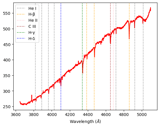
Alnilam B-class: For this class we expect medium amounts of Hydrogen Balmer lines, and some neutral Helium lines. We observe spectral lines of H-γ, H-δ, He I, and C III in our experimental spectra analysis.
Alnitak O-class: In the hottest class of stars, we expect to see ionized helium features. In this graph, we see prominent absorption lines of H-β, H–γ, H–δ, as well as He I, He II and He III, which are in correlation with our expectations.

Capella G-class: We expect heavier elements such as calcium and for the Hydrogen Balmer lines to be less prominent. Compared to stars in A or F-classes, our experimental Capella spectra have less defined H-ε, H–γ, H–δ absorption lines, but a more obvious Ca II absorption line.

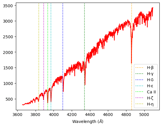
Sirius A-class: This class has the strongest features of the Hydrogen Balmer series. We observe H-β, H–γ, H–δ, H–ε strong spectral lines, and slight H-ζ and H-η absorption lines. Additionally, characteristically of A-class stars, Sirius displays spectral lines of heavier elements such as Mg II and Ca II.

Alhena A-class: Alhena’s spectra are very similar to Sirius’s, being in the same class.

Regulus B-class: Displaying prominent H-β, H–γ, and H–δ Balmer lines, it is in the lower temperature end of B-class, almost an A-class. It has strong Balmer features but still a characteristic He I absorption line that places it in the B-class.
Procyon F-class: We expect to see ionized metals and weaker hydrogen lines than A-classes. Our data shows weaker H-β, H–γ, and H–δ Balmer lines than Alhena or Sirius, but more prominent absorption lines for ionized elements such as Ca II .
Stars can be assumed to be black bodies, and its absorption spectra will overall take the shape of its black body radiation. After extracting the absorption spectra, we attempted to normalize it by dividing the spectra data by its polynomial interpolation to the fourth degree. The polynomial interpolation is our estimate of the black body curve that would be displayed by the star.
Characteristically, an ideal normalize spectrum will not deviate from 1.0 on the y-axis, other than peaks where the absorption lines are. We can directly compare that the peaks in the normalized graphs are where the troughs in the initial spectra data are.

Normalized spectra, Alhena A-class

Normalized spectra, Alnilam B-class

Normalized spectra, Alnitak O-class

Normalized spectra, Capella G-class

Normalized spectra, Procyon F-class

Normalized spectra, Regulus B-class

Normalized spectra, Sirius A-class
Code: Extracting spectra and normalizing data
From here, we will go through how we extracted the spectra from the .fit files using Python, as well as the normalization of the spectra through a polynomial interpolation. This is for 1 star, specifically Alhena, where the code is repeated for the rest of the stars as well, where the only deviation is the addition of absorption lines manually.
Step 1:
#importing relevant modules
import numpy as np
import os
import math
from PIL import Image
from PIL import ImageOps
import astropy
%config InlineBackend.rc = {}
import matplotlib
import matplotlib.pyplot as plt
%matplotlib inline
from astropy.io import fits
from astropy.nddata import Cutout2D
import os
from numpy import asarray
import matplotlib.image as mpimg
from specutils.spectra import Spectrum1D, SpectralRegion
from specutils.fitting import fit_generic_continuum
from numpy import *
import numpy.polynomial.polynomial as poly
from scipy import interpolate
Step 2:
#opening both files to check stats, and positioning a cut out around both spectra
hdulista1 = fits.open(r"C:\Users\Ceinwen\Desktop\ProjectPics\Spectra\alhena_953.fit")
hdulista1.info()
print(repr(hdulista1[0].header))
dataa1 = ((hdulista1[0].data)/256)

positiona1 = (838.5, 660)
sizea1 = (150,1677)
cutouta1 = Cutout2D(np.flipud(dataa1), positiona1, sizea1)
plt.imshow(np.flipud(dataa1), origin='lower', cmap='gray')
cutouta1.plot_on_original(color='white')
plt.colorbar()


hdulista2 = fits.open(r"C:\Users\dhruv\Desktop\Project Pics\Spectra\alhena_954.fit")
dataa2 = ((hdulista2[0].data)/256)

positiona2 = (838.5, 690)
sizea2 = (150,1677)
cutouta2 = Cutout2D(np.flipud(dataa2), positiona2, sizea2)
plt.imshow(np.flipud(dataa2), origin='lower', cmap='gray')
cutouta2.plot_on_original(color='white')
plt.colorbar()
We open both .fit files to check the stats of the data, and cut out the part of the image with the spectra for both data sets, as you can see, the spectra are very faint.


Step 3:
#plotting the cut out

plt.imshow(cutouta1.data, origin='lower', cmap='gray')
plt.colorbar()

plt.imshow(cutouta2.data, origin='lower', cmap='gray')
plt.colorbar()
Plotting the cut-out, taking a closer look, the spectra lines are more visible now.


Step 4:
#converting the file's data into an array and plotting it

xa1 = cutouta1.data
a1 = np.trapz(xa1,axis=0)
plt.plot(a1)

xa2 = cutouta2.data
a2 = np.trapz(xa2,axis=0)
plt.plot(a2)


Step 5:
#finding the mean of both data and plotting it, alongside spectral lines.

a = np.mean([a1, a2], axis=0)
plt.plot(a,"r")
plt.axvline(x=206,color='b',ls=":")
plt.axvline(x=271,color='b',ls=":")
plt.axvline(x=325,color='b',ls=":")
plt.axvline(x=368,color='b',ls=":")
plt.axvline(x=525,color='b',ls=":")
plt.axvline(x=805,color='b',ls=":")
plt.axvline(x=967,color='b',ls=":")
plt.axvline(x=1401,color='b',ls=":")

Step 6:
#doing a line of best fit through the spectral lines's positions.

x1=np.array([206,271,325,368,525,805,967,1401])
y1=np.array([3835.384,3889.049,3933.66,3970.072,4101.74,4340.462,4481.325,4861.3615])
m1, b1 = np.polyfit(x1, y1, 1)
plt.scatter(x1,y1,color="red")
plt.plot(x1,m1*x1+b1)
print(m1)
print(b1)

Step 7:
#mapping the pixel number to wavelength
xo1 = np.arange(1,1678)
func1 = lambda t: (m1*t)+b1
xn1 = np.array([func1(xi) for xi in xo1])
plt.plot(xn1,a,"r")
plt.xlabel ('Wavelength ($\AA$)')
min(xn1),max(xn1)

Step 8:
#plotting the spectra in term of wavelength and including named spectral lines.
plt.plot(xn1,a,"r")
plt.xlabel ('Wavelength ($\AA$)')
plt.axvline(x=4861.3615,color='orange',label="H-\u03B2",ls=":")
plt.axvline(x=4481.325,color='magenta',label="Mg II",ls=":")
plt.axvline(x=4340.462,color='g',label="H-\u03B3",ls=":")
plt.axvline(x=4101.74,color='b',label="H-\u03B4",ls=":")
plt.axvline(x=3970.072,color='c',label="H-\u03B5",ls=":")
plt.axvline(x=3933.66,color='lime',label="Ca II",ls=":")
plt.axvline(x=3889.049,color='m',label="H-\u03B6",ls=":")
plt.axvline(x=3835.384,color='y',label="H-\u03B7",ls=":")
plt.legend()

Step 9:
#doing a polynomial fit to the 4th degree, plotting it on the same graph as the spectra
coefs1 = poly.polyfit(xn1, a, 4)
ffit1 = poly.Polynomial(coefs1)
plt.plot(xn1, ffit1(xn1))
plt.plot(xn1,a,"r")
plt.xlabel ('Wavelength ($\AA$)')

Step 10:
#diving the spectra by the polynomial fit to normalise, and plotting normalised graph

plt.plot(xn1,ffit1(xn1)/a)
plt.xlabel ('Wavelength ($\AA$)')
Finally, dividing the spectra by the polynomial interpolation to normalize the spectra.

Brief Note:
The end of the 2020 third year project came quicker than most years before us, unexpected situations such as strikes and social distancing due to coronavirus have unfortunately prevented us from collecting any more data on the variations in the apparent magnitude of Betelgeuse, detailed in the previous blog post. We have had to cancel our poster and presentation as well.
We are all saddened by the fact we can’t clamber about the dark rooftop that overlooks the Thames and half of London anymore, but I believe this project has inspired many in the group to go further in the field of Astronomy. We all want to thank our absolutely brilliant supervisor, Prof. Malcolm Fairbairn, for his guidance and leadership. He has been looking out for us in more than this project, being an amazing mentor.
