For the Least Squares fit exercise, you have a three column file called “lsqdat.csv” that contains x, y and the error on y, sigma_y and you need to find the best fit straight line which goes through this data. Once you have that, you create a file called “teamname.csv” where “teamname” is the name of your team. For this exercise, given the equation of a straight line isy=mx+c there should be the gradient m on the first line, and the intercept c on the second line (one column, two rows).
All results should be submitted in .csv format, that is comma separated variable format so:-
1.0e0,23.4e0 2.0e0,24.7e0 2.6e0,32.43e0 ……..
or
1.35e2 2.43e2 ………
If everything is working well (and I am sure things will break down at some point during the day), then your results should be published on the big screen, so you can see how well you are doing relative to everybody else. The lower the value of Chi Squared that you produce the better.
For the second exercise, you are trying to predict the value of which will fit the supernova data. Because we are assuming that the Universe is flat (as confirmed by observations of the Cosmic Microwave Background) that means so that by giving your best bet for you have provided all the information we require. So we only need a single number.
The data for this is in the same google directory as for the straight line. The three columns are redshift (z), the difference between the absolute magnitude (m) and the apparent magnitude (M) which we call We don’t know the precise value of the absolute magnitude, or the precise value of the Hubble constant, so we have to treat this as a nuisance parameter, see notes, listen to presentation and ask the helpers or me for more guidance on this.
The third exercise is obtaining the redshift of galaxies from their photometric observations. The Sloan Digital Sky Survey obtains measurements of many millions of galaxies, but it cannot obtain detailed spectra, and hence redshifts, of all of them, or even the vast majority of them. Rather it measures their brightness in five different filter bands. I have provided you with a training set of 8000 galaxies with these five photometric (brightness) measurements, as well as their redshift, as well as a validation set for you to test your fitting algorithms on. Once you have an algorithm you are confident with, you can predict the redshifts of the galaxies in the test data set, and upload them via the form, this will be a one column list of 1000 redshifts (since there are 1000 sets of five brightnesses in the test file, but no redshifts.)
Please feel free to ask any questions you have, and ask me or the other helpers questions during the day.
It was a busy week on the roof, lots of visible planets so we decided to do some imaging:-
Jupiter 26th Feb 2025
Same in black and white.
Jupiter 28th Feb 2025, seeing was a bit worse (wobbly atmosphere due to wind)
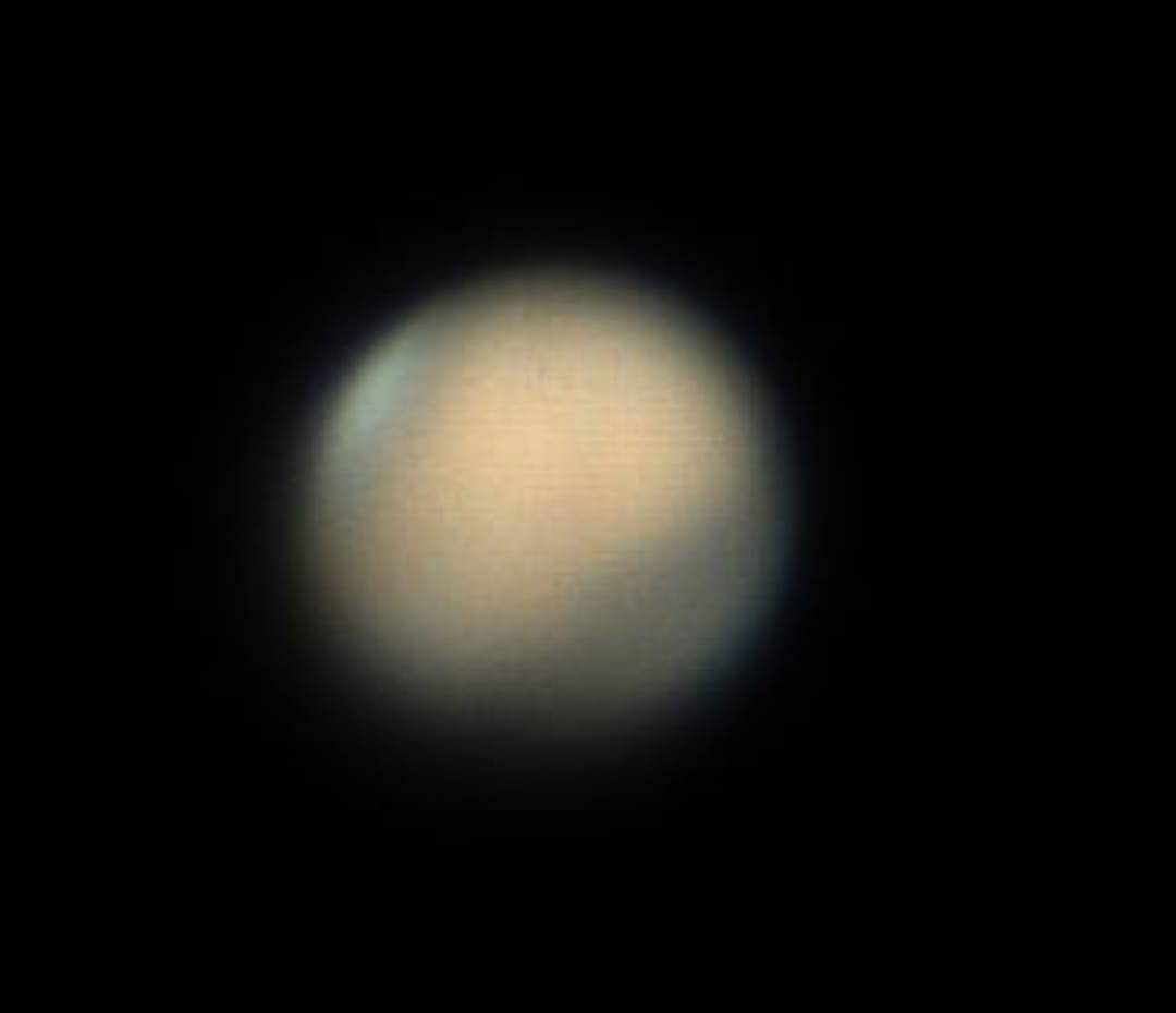
Mars with polar ice cap “clearly” visible
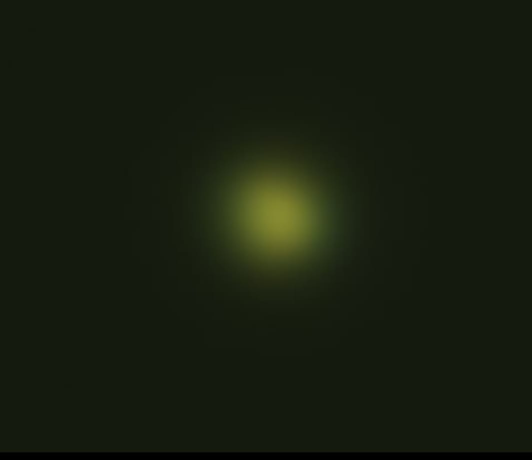
Venus, data processed by student Marta
Now this is Mercury. It’s hard because its small, and its close to the horizon, which means more airmass, and more wobbling. This is probably not the best that could ever be done from central London, but it’s the best we managed this week.
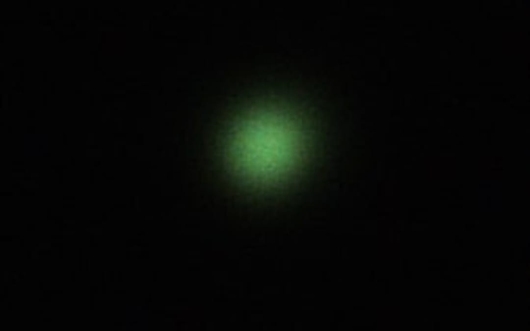
And this is Uranus. Yes it’s not very good. Now the colour is more green than it should have been but it was visibly turquoise in the eyepiece. I think we could improve this more than Mercury, but the conditions were not perfect.
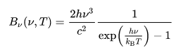
Plank’s law is used to calculate the energy per frequency of the light to get the number of photons per frequency.
This is divided by the energy of a single photon to get the energy per frequency.This spectrum is then multiplied by the response curve of the camera (Quantum efficiency) and the response curve of the filter (RGB data from Astronomik). These curves represent the photon detection efficiency of the camera and filters at different frequencies.
We integrate over the response curve spectrum at each frequency to determine the total number of photons that get through the filter to reach the camera.The results are tabulated in a three column table giving the temperature of the light source and the number of photons that get through the blue and green filters to reach the camera sensor. This allows us to estimate the expected flux of the photons reaching the camera sensor and comparing it with our flux values to gauge the spectrum response through the filters.
import numpy as np
from scipy.integrate import quad
import pandas as pd

# Planck's Law
def plancks_law(wavelength, temperature):
    h = 6.62607015e-34  # Planck's constant
    c = 3.0e8  # Speed of light
    k = 1.380649e-23  # Boltzmann constant

    wavelength_m = wavelength * 1e-9  # Convert wavelength from nm to meters
    frequency = c / wavelength_m
    energy = h * frequency

    exponent = h * c / (wavelength_m * k * temperature)
    intensity = (2 * h * c ** 2 / wavelength_m ** 5) / (np.exp(exponent) - 1)

    return intensity, energy

# Load transmission data for blue and green filters
blue_filter_data = np.loadtxt('Astronomik_Blue.csv', delimiter=',')
green_filter_data = np.loadtxt('Astronomik_Green.csv', delimiter=',')

# Load quantum efficiency data for camera
quantum_efficiency_data = np.loadtxt('QuantumEfficiency.csv', delimiter=',')

# Interpolate transmission and quantum efficiency data
def interpolate_data(wavelengths, data):
    return np.interp(wavelengths, data[:, 0], data[:, 1])

# Calculate total transmission through filters and camera response
def total_transmission(wavelengths):
    blue_transmission = interpolate_data(wavelengths, blue_filter_data)
    green_transmission = interpolate_data(wavelengths, green_filter_data)
    quantum_efficiency = interpolate_data(wavelengths, quantum_efficiency_data)
    return blue_transmission * quantum_efficiency, green_transmission * quantum_efficiency

# Function to compute the number of photons
def photons_per_frequency(wavelength, temperature, filter_type):
    intensity, energy = plancks_law(wavelength, temperature)
    total_trans_blue, total_trans_green = total_transmission(wavelength)
    if filter_type == 'blue':
        #filter_transmission = interpolate_data(wavelength, blue_filter_data)
        ppf =  intensity * total_trans_blue / energy
    elif filter_type == 'green':
        #filter_transmission = interpolate_data(wavelength, green_filter_data)
        ppf = intensity * total_trans_green / energy
    else:
        raise ValueError("Invalid filter type. Use 'blue' or 'green'.")
    return ppf

# Integrate the photons per frequency function
def integrate_photons(temperature, filter_type):
    return quad(photons_per_frequency, 300, 1000, args=(temperature, filter_type))[0]

# Generate table of temperatures and number of photons
temperatures = np.linspace(300, 2898, 50)
blue_photons = [np.log10(integrate_photons(temp, 'blue')) for temp in temperatures]
green_photons = [np.log10(integrate_photons(temp, 'green')) for temp in temperatures]

# Create a pandas DataFrame
results_df = pd.DataFrame({'Temperature (K)': temperatures,
                           'Blue Photons': blue_photons,
                           'Green Photons': green_photons})

print(results_df)

results_df.to_excel('photons_results.xlsx', index=False)
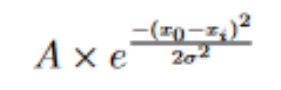
As these images were taken from Central London, there was a significant amount of light pollution that had to be accounted for in all the images. The effect of light pollution was found by fitting a gaussian distribution over a histogram of background pixel values, defined by:
The standard deviation of this fit accounts for this error on our data due to light pollution, where A is the amplitude, σ is the standard deviation, x0 is the centre of the distribution, and xi is the current data point we are generating a value for.
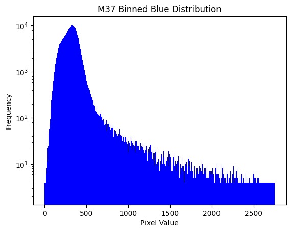
Looking at the histogram for the entire image for how many pixels of a certain brightness exist in the image, we can see that the grand majority of the data is quite dark, but not zero. We can assume that this is the light pollution, and the far more infrequent, brighter values are the stars.
In this histogram, the y-axis is logarithmic to show the low frequency data points. The pixel value is the brightnesss of a pixel, and the frequency is the number of pixels with that brightness found in the image.
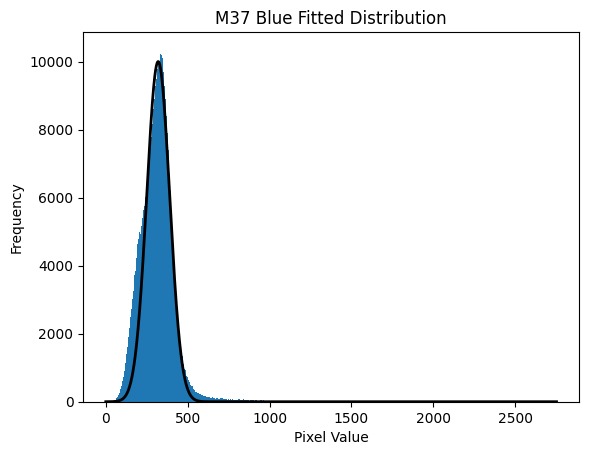
Applying an initial fit:
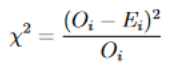
To test the goodness of our model data to our observed data, we implemented a chi-squared test, given by the below equation. A small chi squared value close to the range of pixel values we have implies a good fit.
Where O is observed data & E is expected data. We are using the Poisson Error squared as the denominator on our Chi Squared due to the Poisson nature of our observed values, a number of photons detected per exposure time.
To test how well our distribution fits, we employed a grid search method to vary each of the three parameters in our gaussian through an 11 x 11 x 11 grid, and calculating a chi-squared value for every combination of parameters in that grid. The smallest chi squared is then taken to be the centre, and a new grid is formed around it and the parameters are varied again. This is repeated until chi-squared stops decreasing, meaning we have found the minimum chi-squared value. The parameters of this best fit can be used to find the error due to light pollution.
def grid_search(unique_values, polluted_bins, ab, xob, wb):
    # Grid Jump Method

    # Define grid sizes

    dw = 10
    da = 100
    dxo = 20

    # Define data
    n = len(unique_values) #number of data points
    x = polluted_bins #our data
    y = generate_current_fit(polluted_bins) #fitted data

    # Initialize variables to store optimal parameters
    at = ab
    xot = xob
    wt = wb
    chisqmin = float('inf')

    # Perform grid search
    for l in range(-5, 6):
        w = max(0.0, wb + float(l) * dw)

        for k in range(-5, 6):
            a = max(0.0, ab + float(k) * da)

            for j in range(-5, 6):
                xo = max(0.0, xob + float(j) * dxo)

                # Compute chi-squared
                chisq = 0.0
                for i in range(n):
                    chisq += ((x[i] - a * np.exp(-((x[i] - xo) / 2*(w**2)) ** 2)) / max(1.0, x[i]))

                # Update optimal parameters if chi-squared is lower
                if chisq < chisqmin:
                    xot = xo
                    wt = w
                    at = a
                    chisqmin = chisq

                    print("New optimal parameters found:")
                    print("a =", a)
                    print("xo =", xo)
                    print("w =", w)
                    print("chi-squared =", chisq)

    print("Optimal parameters:")
    print("a =", at)
    print("xo =", xot)
    print("w =", wt)
    print("Minimum chi-squared =", chisqmin)

    return at, xot, wt

print("--------------BLUE--------------")
bat, bxot, bwt = grid_search(unique_values_blue, polluted_bins_blue, 13000, 455, 130)
print("-------------GREEN--------------")
gat, gxot, gwt = grid_search(unique_values_green, polluted_bins_green, 8000, 418, 150)
In the above code, w refers to the standard deviation σ.
Error Propagation
Written byNiharika Rath
Error analysis is obligatory to make valid scientific conclusions and to account for errors that gratuitously creep into the observations of any experiment. With our observations, we have 2 main sources of errors to account for, light pollution and a Poisson count error.
Following this, we proceeded to propagate the errors for the physical quantities used in plotting our HR diagram, namely the Flux, Magnitude and B-G values.
The √N is the error due to a Poisson counting error, where N is the count in a pixel. In our data, the count N is our flux F. The total error on the flux of all the pixels in the star is therefore √F. The error due to light pollution on the other hand is the width of the gaussian we fitted, σ. Adding these in quadrature gives:
We calculated our magnitudes in each filter using the equation:
In order to propagate our errors through this, we used the error propagation equation of the form:
So our errors on magnitude have the form:
After subtracting the magnitudes in the green filter from the blue filter, the error on our B-G value is:
Using this, we attempt to prove the validity of our results and generate an HR diagram with values that match the literary ones, of course with an error associated with it:
Astronomers often use a quantity called the “signal to noise ratio” (S/N) to determine the accuracy of measurement or observation. This is the ratio of the signal (mean observation) divided by the noise (standard deviation of the observation). Oftentimes in similar projects we are working with Poisson statistics because we are only capturing some of the photons coming in from a distant source. For Poisson statistics, the standard deviation of a single measurement is the total number of counts.
For real astronomical observation, we must take into account that the star is observed on top of the sky background, which will produce an associated error in its measurement.
The S/N ratio of an observation for a CCD is given by
Where So is the shot-noise in the detected photo-electrons from the source, Ss is the shot-noise in the detected photo-electrons from the sky background, SD is the shot-noise in the thermally excited electrons, i.e the dark current, and R is the time-independent readout noise. Note, there is no square root on this term. The readout noise is the standard deviation in the number of electrons measured – it is not a Poissonian counting process.
In our project, however, the last two terms in the sum under the square root were ignored due to them having a negligible impact on the overall value. They are relatively small in the CCD documentation. Below is the line of code we used to calculate the ratio. It is taking a cutout of background and summing over all the pixels to get a total flux of the star. The rest of the propagation remains the same:
def calculate_snr(image, star_center, star_radius):
    # Define circular aperture for the star
    aperture_star = CircularAperture(star_center, r=star_radius)
    star_flux = aperture_star.to_mask(method="exact").cutout(image)

    # Define circular annulus for background
    aperture_bckgr = CircularAnnulus(star_center, r_in=star_radius+3, r_out=star_radius+10)
    bckgr_flux = aperture_bckgr.to_mask(method="exact").cutout(image)

    signal = np.sum(star_flux)

    # Calculate SNR
    snr = signal / np.sqrt( signal + np.sum(bckgr_flux) ) #/ len(bckgr_flux))

    return snr
Then adjusting “calculate flux errors” in our propagation code:
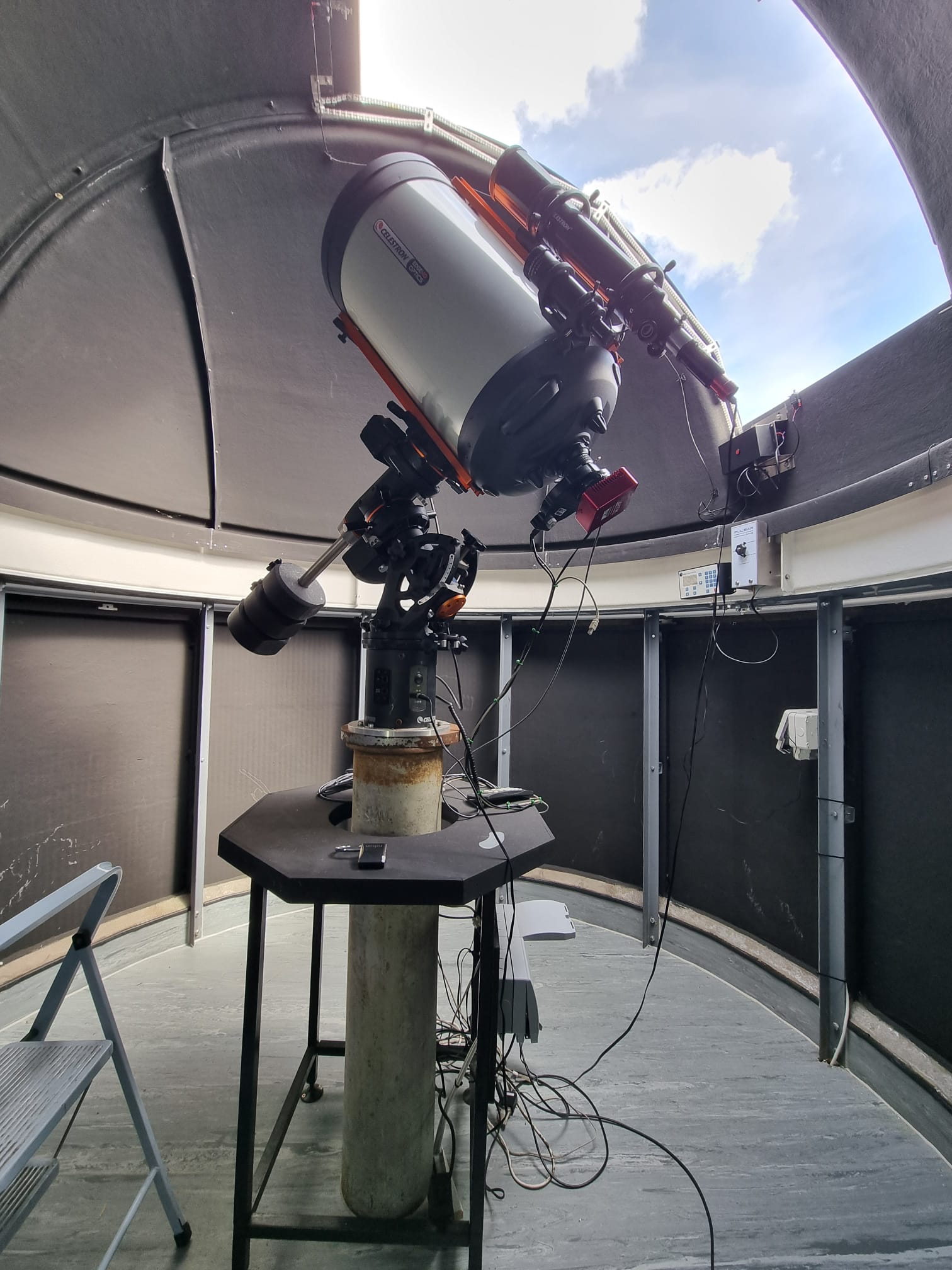
As the dome atop KCL was recently rebuilt, the telescope needed to be re-aligned.
The shiny new dome, with a new, wider hatch.
This telescope is mounted on an equatorial mount, which compensates for the Earth’s rotation by polar aligning with North’s celestial pole to track astronomical objects and keeps the telescope steady; this mount must face North to function correctly. This was our first task, before the telescope could be mounted. We located North by identifying a local church spire, which happened to be directly North of the telescope. The longitude for the telescope and spire were the same to 3 decimal places, -0.115. By loosening the 6 bolts around the base of the mount, holding it to the pedestal, the mount can be rotated carefully without needing to dismantle the telescope. The mount was then turned to face the spire, aligning it with North as accurately as we could. Only then could the telescope be mounted.
The spire directly north of the KCL observatory.
Next, we used the built-in features of our telescope’s program. Coordinates and the hemisphere were selected before we decided on an appropriate program to polar align the telescope. There are many programs to select from, but the All-Star Polar Alignment function is the simplest and quickest function to use. It allowed us to identify approximately where a known astronomical object will be in our location’s sky, direct our telescope to that object and then manually align & track the object with the telescope. After manually centering the selected alignment object in our finderscope and eyepiece, this function will then model the sky based on the input and centering such that we could enter the latitude and longitude of star clusters to locate them in the night sky.
Unfortunately, London is plagued by a constant orange haze of light pollution. For the purposes of our project, light pollution harms our data as it adds a seemingly random value to all areas of the image, making it impossible to read the actual brightness of celestial bodies.
In order to remove the noise pollution, there are a few possible methods one could take. We tried two methods with varying degrees of success.
When taking the photos of each celestial body, we included an extra offset shot of the nearby sky. This shot was to provide us with a reference from which we could determine values to remove from our main photos, in order to remove the noise.
Method 1 – Minima removal
The simplest method of using the offset image is to compare each image with the offset image and generating an array of minima between the two images, as shown below.
Figure 1 – Code in order to generate a “mud” and remove it from the original image.
As described, the code generates an image showing the minima between the main images and the offset image, then subtracts this ‘mud’ from the original image to remove the noise pollution. The function backround_removal also needs error handling for underflow errors, as when values go below zero, they wrap back around to the maximum 32 bit integer. This can be avoided by implementing an if statement that checks if any values drop below zero, and returns them to zero.
However, as is now visible, artifacts in the form of dark holes appear on the image with the mud removed that line up with the stars visible in the offset image. In an ideal scenario, you would attempt to find a patch of sky with as few stars as possible in order to avoid this.
Figure 2 – The “Mud”. Note how the holes line up with the brightest stars in Figure 2 below.Figure 3 – The offset image, which lines up with the holes in the mud
Method 2 – Gradient Removal
n order to get rid of the artifacts, we instead found the gradient between the offset image and the 10 images, and from this we generated a noise map that represented the background in each image. Adding another error handler to avoid underflow errors, we then subtract the noise map from the original image, resulting in a clean, artifact free image from which we can extract data.
Figure 4 -The alternate method, generating a 2D background image that can then be subtracted from the original.Figure 5 – The noisemap generated by figure 3. As you can see, there are no visible stars left to cause artifacts, just a map of the skies brightness levels.Figure 6 – One of the final images with no background.
In this project, we are looking at objects called star clusters, which are groups of stars that are gravitationally bound together. There are two types – globular clusters and open clusters.
Globular clusters are large collections of thousands of millions of red stars, most of which are population II stars formed a few million years after the Big Bang. The stars are densely packed together, and the shape of the cluster is roughly spherical1.
Figure 1: Globular cluster M3.
Open clusters are made up of a few hundred stars which are much less densely packed together than globular clusters, and are without a distinct shape. These stars are younger blue stars, tens of millions of years old, and are weakly gravitationally bound2. For this project we took pictures of M35, M36, and M37, which are all open clusters.
Open clusters are ideal for the purposes of the project, since the stars are further apart from each other, making them easier to resolve individually. This is necessary to be able to find the apparent magnitudes of the stars. Additionally, it is assumed that all the stars in the cluster are the same distance from us, allowing us to calculate the absolute magnitudes.
Figures 2 and 3: Open clusters M36 and M37.
HR diagrams
HR diagrams are a useful tool in astronomy, as plotting stars within a cluster based on their magnitude and colour-temperature allows the study of the stars’ relative stellar evolutionary stages and provides an idea about the age and the relative distances of given clusters3, which was also the objective during the project.
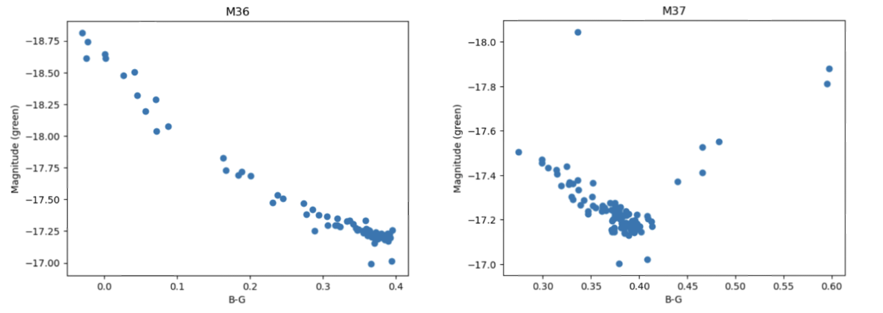
For the data here, green and blue filters4 were used to attain the difference in the magnitudes corresponding to a colour index in the observational HR diagram, being plotted against the apparent (green) magnitude.
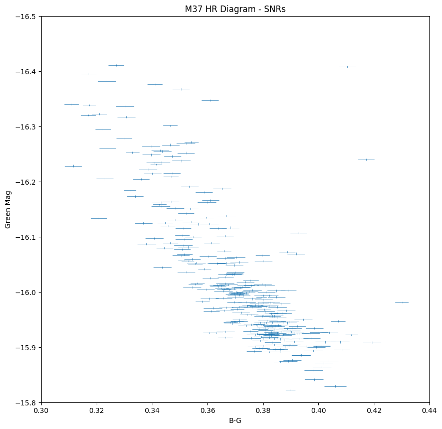
Figures 4 and 5: HR diagrams for M36 and M37.
The upper left region in the diagrams corresponds to the bluer and brighter stars, while the redder and dimmer stars are located at the bottom right. The stars in a HR diagram for a relatively young open cluster, which mostly contains stars burning hydrogen into helium, are expected to lie along the main sequence branch – this is seen in the HR diagram for M36. In older clusters, the main sequence cut-off becomes more visible as the more massive stars burn hydrogen at faster rates and are consequently spending less time in the main sequence, leading older clusters to have more prominent red-giant branches. In globular clusters, more stellar evolutionary stages are present due to the clusters age, which can be seen in the HR diagram for M3.
Figure 6: HR diagram of M3, showing more distinct branching and stars in variety of evolutionary stages6.
Identifying the turnoff point from the diagram and comparing the mass and brightness of the most massive remaining star in the main sequence, allows us to further estimate the age of the star and – as stars within the cluster are estimated to have formed around the same time – the age of the cluster5.
In this post, the concept of the hot pixels will be analyzed, the importance of removing the hot pixels from the FITS files will be emphasized and parts of the coding and the reasoning behind the steps followed will be explained.
What are the hot pixels and how are they obtained?
Hot pixels are single sharp pixels located at random locations of common images taken by digital cameras. They are points that do not react linearly to incident light captured by the lens. An important feature of the hot pixels is that they appear in the same location regardless the frame. This means they do not move, and they remain at a fixed position.
Hot pixels are caused due to electrical charges which appear into the sensor well of the camera’s lens. Since they are very sharp, and they are individual extremely bright pixels, they cannot be observed while looking at the image taken. However, they are very easy to determine while zooming at the images closely during processing, especially if the background of the image is very dark, such as the images taken from a telescope. They can also be visible when the sensor’s temperature increases or at very high ISOs[1]. The weather conditions during the photoshoot also have impact on the existence of the hot pixels since, if the temperature of the surroundings is high, it is ideal for their formation of hot pixels on the lens during the shoot. Finally, they tend to appear far more often in long exposure images. The reasoning behind the formation of the hot pixels is that while capturing less light from the scenery in the given moment, the patterns obtained by the camera sensor are comparatively stronger in that specific moment. Lenses and camera sensors get hotter and hotter as they use long exposures.
Why & how to remove hot pixels?
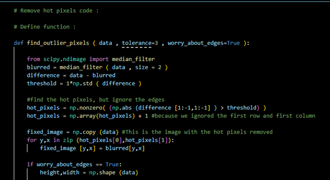
It is very important to remove the hot pixels from an image. The main reason is that it affects the image significantly during close viewing or printing. The only way they can be removed is by following a processing method after the image is taken. This can either happen through photo editing or coding. In this particular article, the second method will be analyzed and explained in detail.
Figure 1- defining the function that will find the hot pixels of the FITS files. In this part of the code, median filter is being used, however, it can be replaced by a gaussian filter instead.
On Figure 1, the function that determines the hot pixels of each FITS file must be defined. In the first part of the code, the edges must be ignored, and they will be found separately later on. In order to understand the purpose behind it, we need to imagine the filter being a square with the center passing from every point of the image obtained. As the detector approaches the edges of the image, the corners of the square filter will exceed the limits and therefore the values they will obtain will be set by Python to zero, which affects the rest of the data (median/Gaussian filter).
Figure 2- Finding the hot pixels at the edges.
As indicated in the Figure 2 above, the next step of the code is to find the pixels on the edges of the image, but not the corners. Repeat the process for the left and right edges, top and bottom.
The next step is to find the hot pixels of the image at its four corners. The code used is very similar to the one used to determine those at the edges and can be indicated in the Figure 3 below:
Figure 3- Finding the hot pixels at the four corners of the image.
Using the previous Figures, the hot pixels can be obtained. Since the code would be required to be repeated for all images in order for them to get stacked, a part that repeats the following method can be introduced, which keeps the code simple and neat. However, the easiest method is to simply repeat the code for each FITS file of each cluster. A suggestion can be found below on Figure 4:
Figure 4 – Removing the hot pixels for or images before stacking.
When the data of the star clusters are collected using a CCD camera, the data is saved as a FITS file. To handle this FITS file in python, first, we need to understand what FITS files are. FITS (Flexible Image Transport System) is a file format designed to store, transmit, and manipulate the data saved on the file. The data stored in a fits file is multi-dimensional, like a 2D array. The pixel data from the camera is stored as a 2D or 3D array depending on the type of image. For example, if the data is monochrome, it is stored as a 2D array; if it is RGB, it is stored as a 3D array. The image metadata is stored as headers in ASCII format, which is readable by humans.
Handling FITS file in Python
To handle the FITS file in python, we first need to install a package called AstroPy. AstroPy is installed using the command line function on our compiler, which is python. We also install other valuable packages like photutils which detect stars and their positions on the image.
Figure 1: Installing AstroPy Package using command line function.
In the command line, we use the pip command to install the latest version of AstroPy and other useful packages. Once the needed packages are installed, we must import all necessary packages onto the jupyter notebook. For example, to open the fits file, we need a specific function of astropy to handle fits; the fits function is imported from astropy.io, as shown in the code below.
import numpy as np
import matplotlib.pyplot as plt
from astropy.io import fits
from matplotlib.colors import LogNorm as log
from astropy.stats import SigmaClip
from photutils.background import Background2D, MedianBackground
Once the packages are imported, we import the fits file onto our jupyter notebook and save it to a variable, as shown in the code below. Every fits file is saved into different variables.
To ensure the fits files are imported correctly, we must also ensure that the fits files are saved in the same directory as the jupyter notebook. After importing the fits file onto a variable, as shown in the code above, we now need to open them to manipulate the data, which is done using the fits.open() function, as shown in the code below.
Once the fits file is opened onto a variable, we now need to extract the data and store it onto another variable so that the data can be manipulated. The code to extract data is shown in the code below.
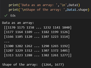
We extract the data as a 32-bit file (as shown in the code above) so that while manipulating the data, we avoid problems like stack overflow while processing the images. The extracted data can remove hot pixels, background, and stacking. This extracted data is a 2D array where every data point is the pixel value. We can also determine the shape of the array, which gives us an idea of the no. of pixels in the camera sensor.
Figure 2: Extracted data as an array and the shape of the array.
Figure 3: Raw data of M35B.
Figure 3 is the image representation of the extracted raw data of M35B in the log scale. This raw data contains hot pixels and a background, which is removed before stacking all the raw images collected.
Hello everyone! We are the Telescope Group 2023: Sof, Stel, Sara, Sarthak, Elvi, Matin, and Malcom. As part of our 3rd year research project, we are looking at different star clusters in London’s dark skies to measure the age of the stars within the clusters and produce a Hertzsprung-Russell (HR) diagram for them.
Here, we will be presenting how the FITS files, an astronomy file format, are handled in Python and the steps taken to get the HR diagram of the star clusters. The objects we have captured are the open clusters Messier 35, Messier 36, and Messier 37 on the night of 08/February/2023. We also observed the Orion Nebulae M42, and globular cluster M3.
The steps taken for our project each have a detailed blog post and are as follows:
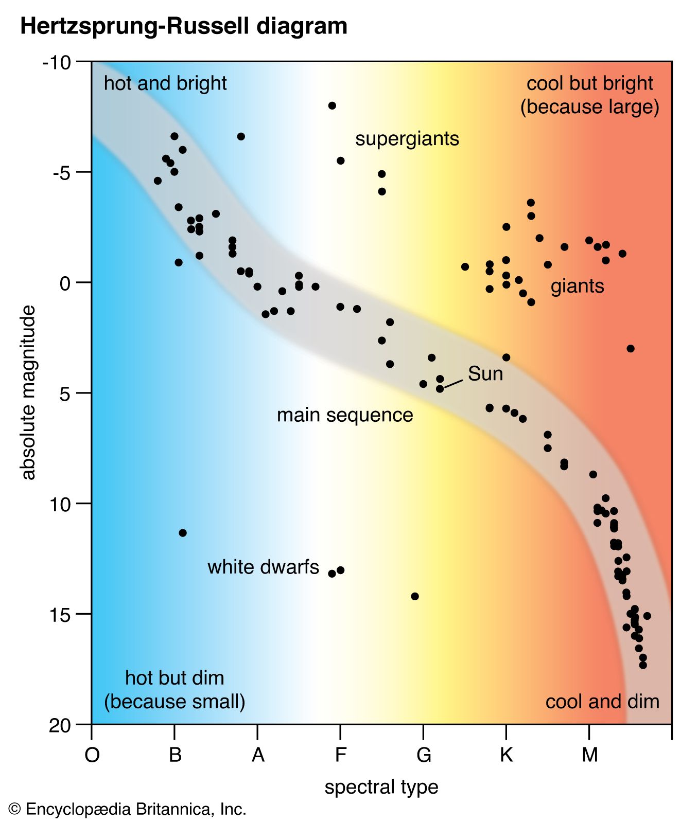
A Hertzsprung-Russell (HR) diagram is plot of stars showing the relationship between the stars’ absolute magnitude versus their effective temperatures. The absolute magnitude corresponds to the stars’ luminosities with negative values being brighter. The effective temperature can be shown using the stellar classification, where the stars from O to M correspond to decreasing temperate on the x-axis.1
An important feature in the HR diagram is the main sequence (MS), the region where the primary hydrogen-burning takes place within a star’s lifetime. Looking into detail where the MS ends, the “MS turn-off”, gives astronomers information about the age of the star cluster.
The general layout of the HR diagram can be seen below, where stars of greater luminosity are located at the top of the diagram, and stars with higher surface temperature are towards the left side of the diagram.
The data captured using the telescope at King’s gives us a FITS file, the most common digital file format in astronomy, and were captured with the blue and green filters attached. From that, we were able to open the files and get on with extracting the data. For this post, data from the M35 blue filter will be used. The raw image for M35_blue from Python can be seen:
Raw image of one of the data files for M35 Blue filter.
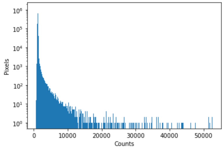
However, this raw image does not only contain the stars; it includes hot pixels captured by the filters and a background. The histogram below shows the numbers of counts vs the pixels of the image above:
Histogram of the data set above with the number of counts on the x-axis and the number pixels on the y-axis.
The brightest stars would be located on the histogram where the sharp peaks occur at the right of the curve. The highest peak of the histogram on the left side corresponds to the background of the image.
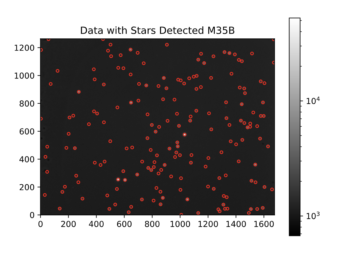
Next, the hot pixels needed to be removed from the image (detailed post here). Below is a picture showing the stars detected on the M35_Blue image after removing hot pixels using a code in Python:
Stars from M35_Blue are detected with a red circle around them.
The following procedure involved finding the background for it to be subtracted from each data set. The detailed methodology of background removal can be accessed here. The same steps were taken for each of the 10 data sets captured for M35_blue and M35_green. Now, the 10 images can be stacked to form:
Stacked image of M35 after removal of background and hot pixels in the blue filter.
The step afterwards was to identify the stars in the blue and green stacked images by comparing the two and see which stars overlap, i.e. correspond to the same star in the different filters.
After pairing the stars, the pixel counts of each star in both the blue and green images are found to compute the star’s apparent magnitudes (B and G). Finally, G vs. B-G is plotted, and this would form the observational HR-diagram of M35.
Observational HR diagram of open cluster M35.
The plot above displays HR diagram of M35, where the Main Sequence branch is clearly shown. The MS turn-off point is where the stars leave the MS and form “Giants” which are seen on the top right of the diagram. Since most stars are on the MS branch, and there are very few giants, this concludes that the open cluster M35 is fairly young.
Conclusion
This project aimed to produce an HR diagram of M35 starting from extracting the data in the FITS files to comparing the stars in the stacked images of the blue and green filter. The same methodology was applied to M36 and M37. This post provided a summary of the steps taken to reach the final result where details can be found in the appropriate separate posts.